Strategy, Identity, Motion, Website, 3D Design,

°•.Archivist of Small Things.•°


branding | INSTALLATION | WEB
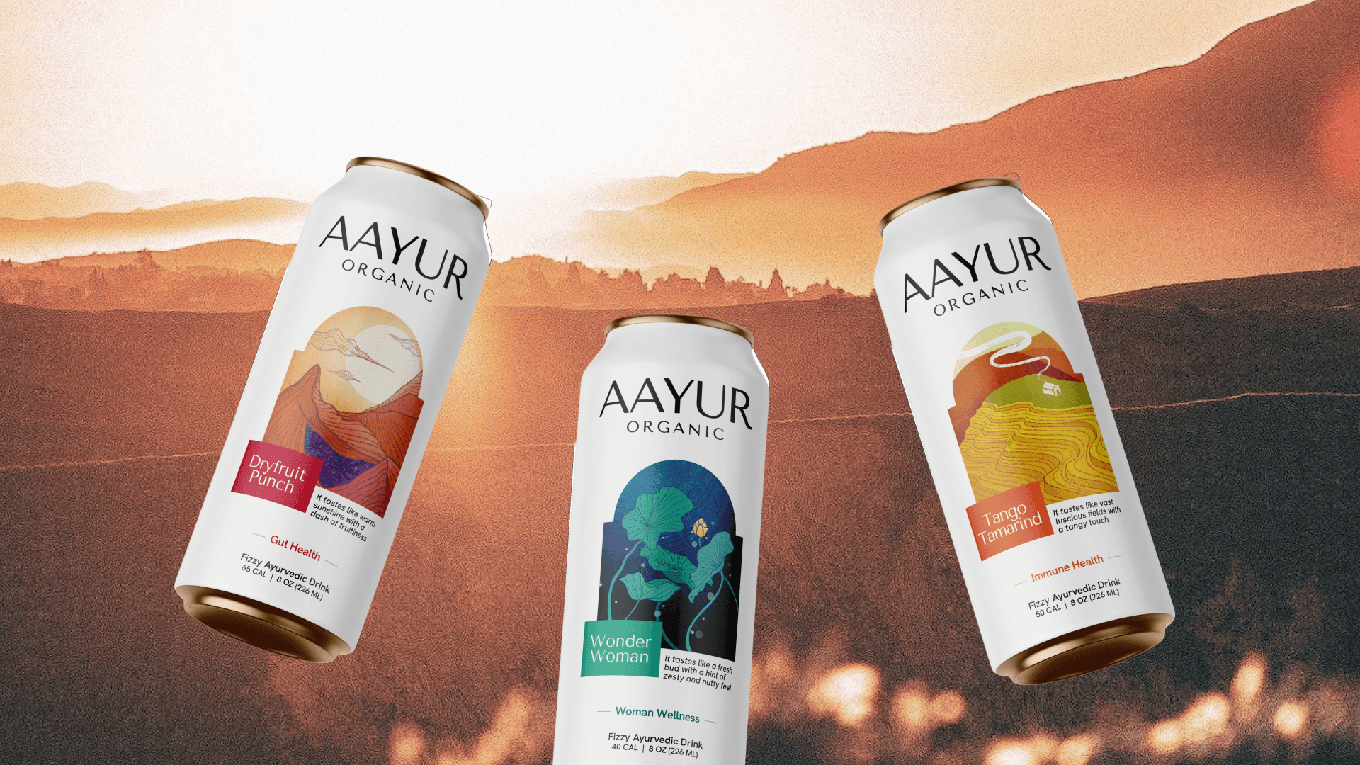
Aayur Organic—A daily ritual of Ayurvedic experience.
>> Dive Deeper
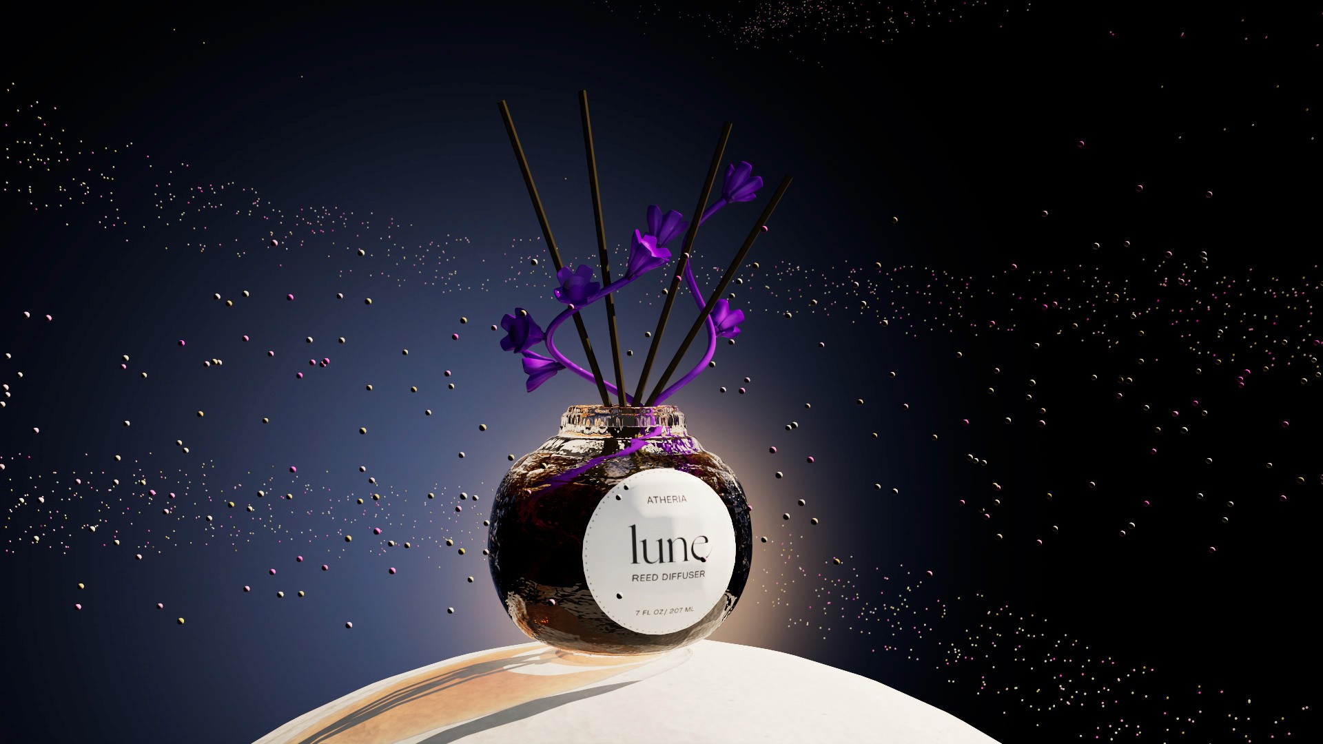

illustration | 2d motion
Buddle Skincare—Soothing botanical experiences as soft as babies <3


branding | INSTALLATION | WEB
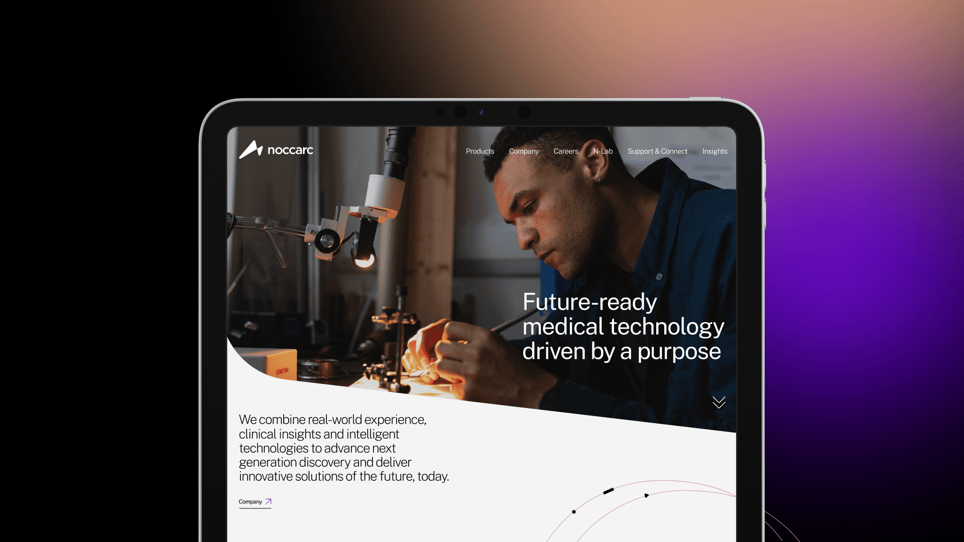
Noccarc MedTech—A medtech venture to an healthcare company
>> Dive Deeper

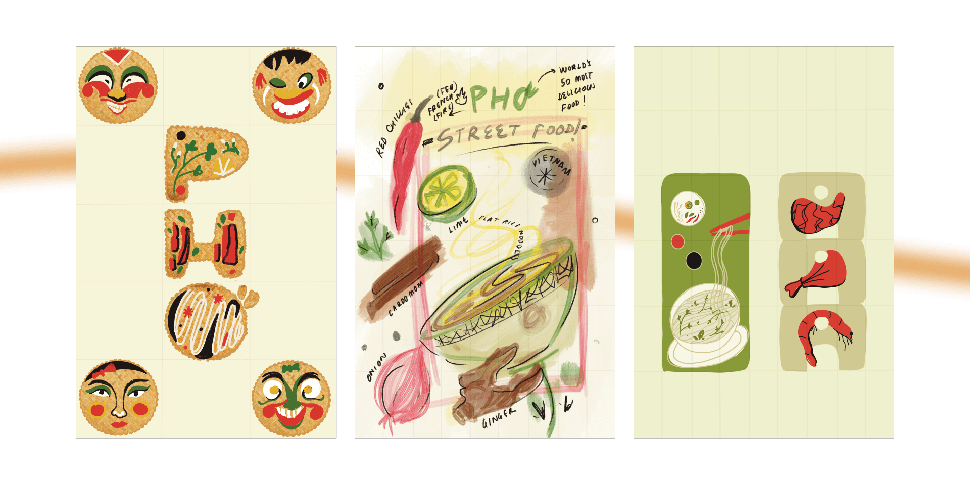

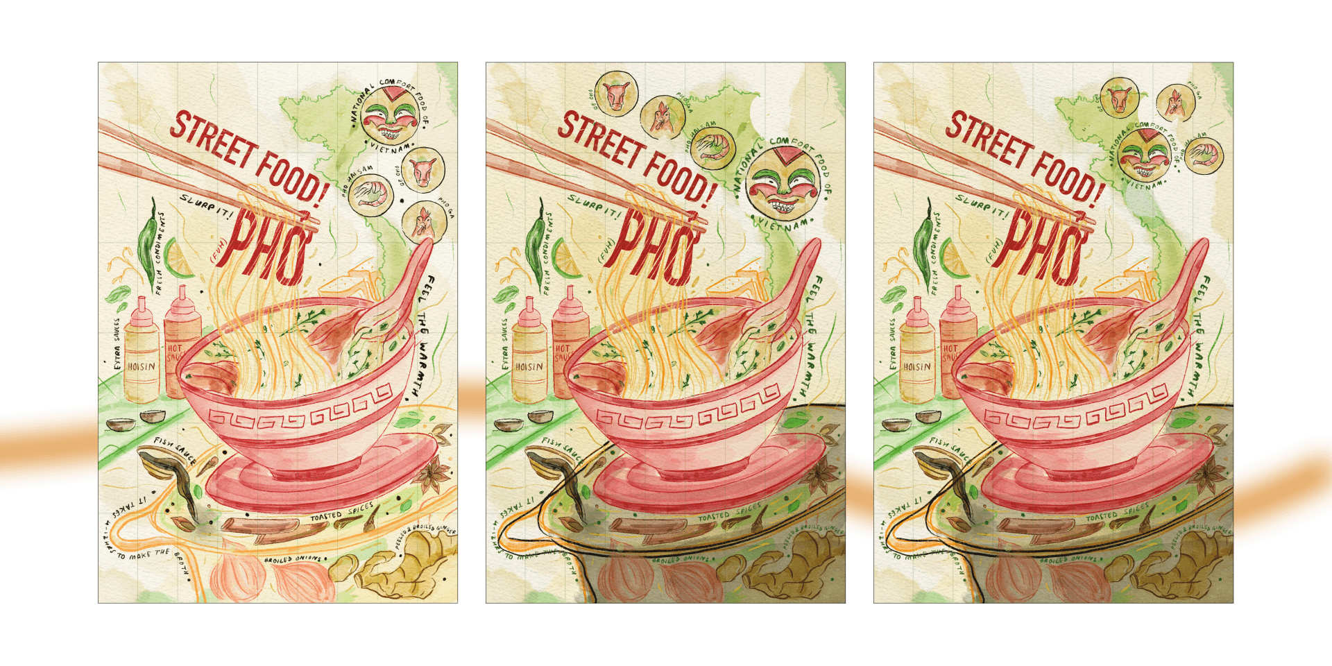
illustration | POSTER
Pho'—Street food poster for an internation market
>> SEE PDF CASESTUDY


branding | INSTALLATION | WEB
Noccarc MedTech—A medtech venture to an healthcare company
>> Dive Deeper


illustration | 2d motion
Buddle Skincare—Soothing botanical experiences as soft as babies <3

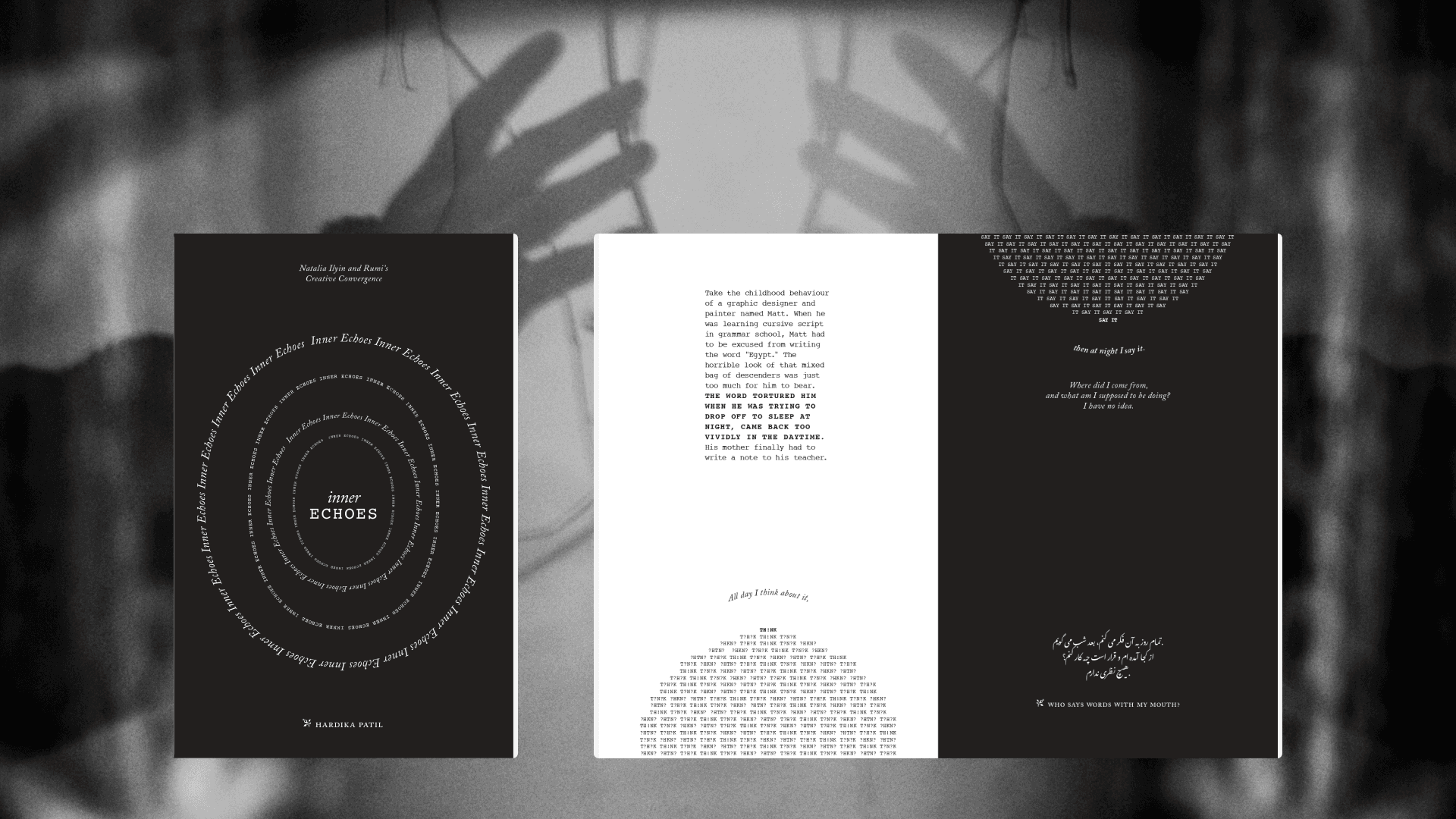
branding | INSTALLATION | WEB
Noccarc MedTech—A medtech venture to an healthcare company
>> Dive Deeper
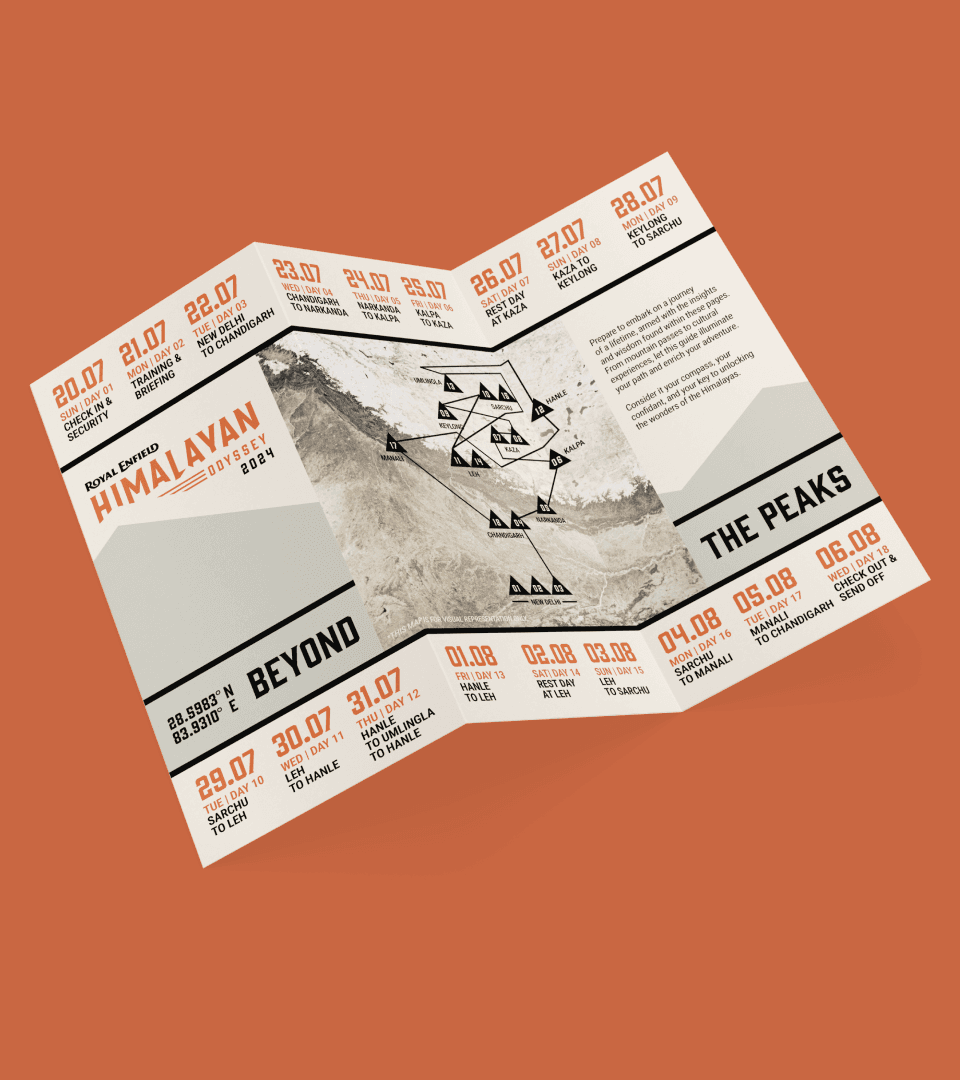
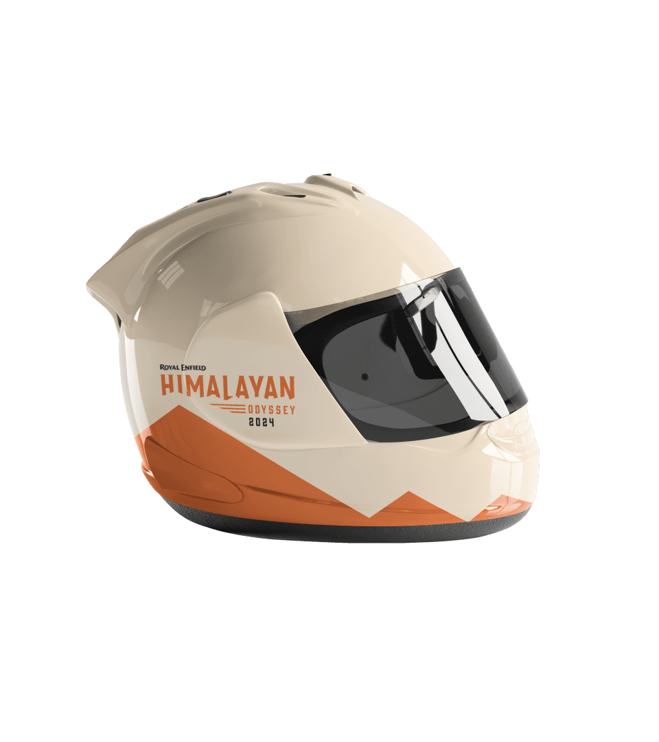
illustration | POSTER
Pho'—Street food poster for an internation market
>> SEE PDF CASESTUDY
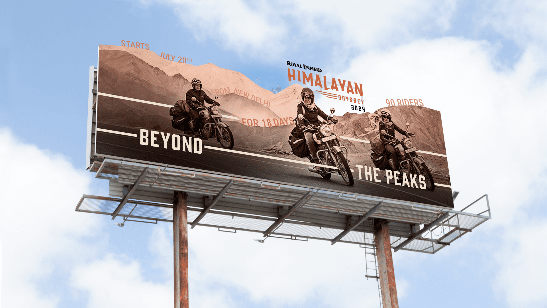
branding | INSTALLATION | WEB
Noccarc MedTech—A medtech venture to an healthcare company
>> Dive Deeper
branding | INSTALLATION | WEB
Noccarc MedTech—A medtech venture to an healthcare company
>> Dive Deeper


Digital Designer & Artist, specializing in web design, visual systems, and concept driven digital experiences.
Fast-learning and persistent, interested in how visual history and contemporary technology speakto each other.
Ofri Colada
Skills & Software
Wix, p5.js, Weavy, Brik, Basic Coding,AI-assisted Development, Figma, AdobeCreative Suite, Maya 3D, Glyphs, Midjourney,Visual Research, Concept Development.Code-based Visual Systems
Patil
>>

Best of my work:
Whisper Wall
experience design
Buddle Skincare
MOTION DESIGN
Aayur Organic
MOTION DESIGN
Whisper Wall
MOTION DESIGN
Whisper Wall
MOTION DESIGN
Whisper Wall
MOTION DESIGN
Whisper Wall
MOTION DESIGN
Whisper Wall
MOTION DESIGN
Whisper Wall
MOTION DESIGN
Whisper Wall
MOTION DESIGN
Whisper Wall
MOTION DESIGN
Whisper Wall
MOTION DESIGN
colophoN
A NOTE ON
THE TYPE
THE TEXT OF THIS WEBSITE WAS SET IN NEWSREADER
AND GEIST MONO TYPEFACES.
Bembo is an old-style humanist serif typeface originally cut by
Francesco Griffo, a prolific punchcutter in Venice 1495. It was later
revived by Stanley Morison, an English Typographer in 1929
to adapt to the machine composition and typesetting requirements
of the day. The calligraphic style that the serifs pronounce imparts
a warm human feel to the typeface. In more modern settings it has
a place in movie and book titling, as well as representational texts.
Univers is a neo-grotesk sans-serif designed by Adrian
Frutiger in 1957. The original marketing for Univers deliberately
referenced the periodic table to emphasise its scope of having
a comprehensive range of weights and widths. Its design
revolves around geometric shapes, resulting in a versatile,
modern and functional appearance. The font’s even stroke
weights and consistent letterforms make it highly readable in
various sizes and on different platforms. Frutiger himself has
commented: "Helvetica is the jeans, and Univers the dinner
jacket."
DESIGNED BY HARDIKA PATIL
Digital Design
Website, Product Design


Identity & Systems


UX/UI Design
UX/UI Design
UX/UI Design
IF YOU
LIKE MY WORK
WISH TO HIRE ME
JUST CHAT
Write to hardikapatil23@gmail.com

i’m real˘.˘
I have a hybrid background across different forms of visual communication—motion design, brand identity, cultural storytelling, dimensional design, and creative coding.
This integrated makes my approach unique and the skillsets in bring to the table.
cv

based of DFW, TX, US
ˆ-ˆ ˘.˘ ˜_\˜ ˚o˚
supra expressive human being

iamhardikapatil
2017-2026.
HARDIKA PATIL.
ALL RIGHTS RESERVED.
COLOPHON.
