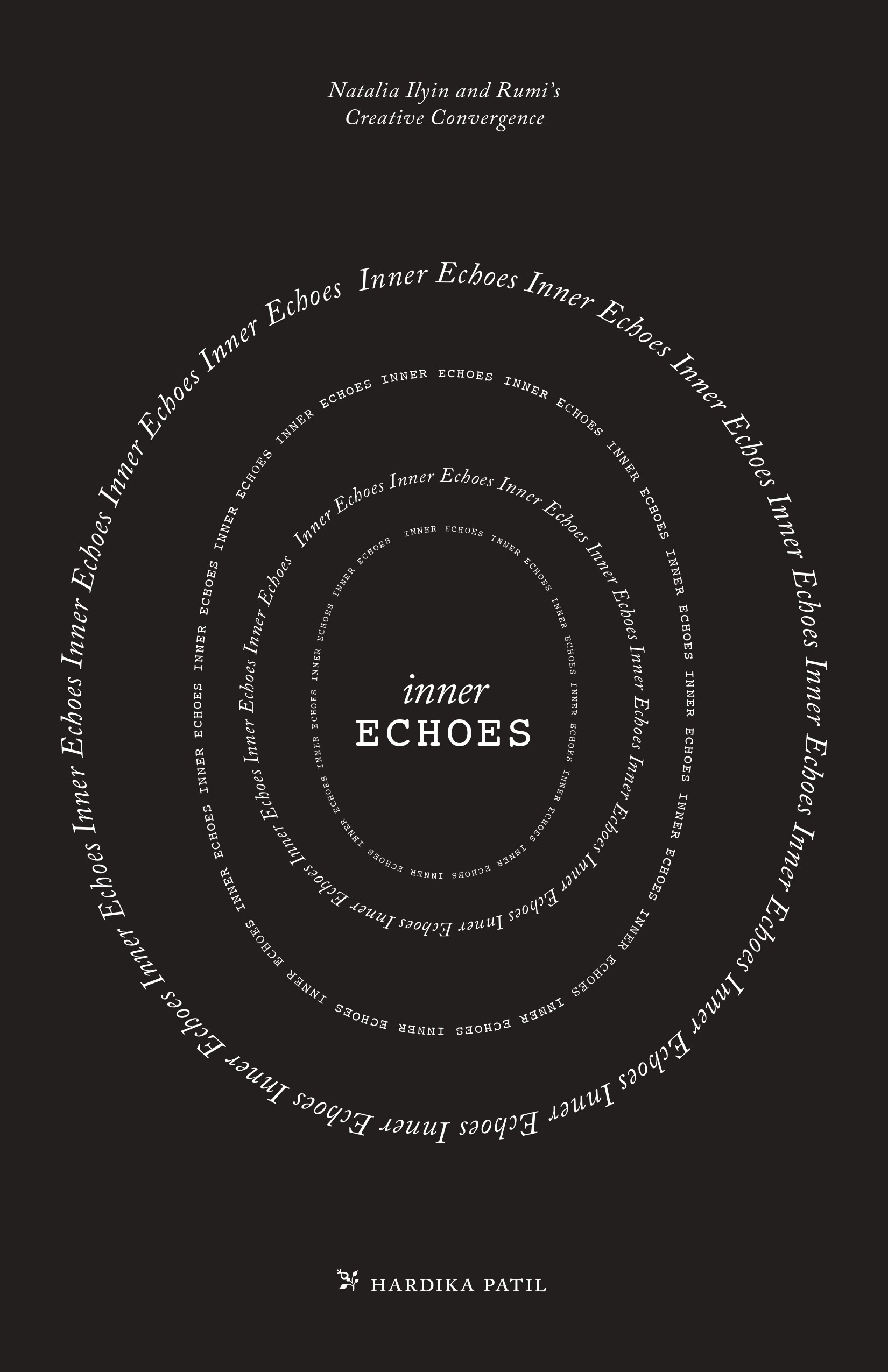
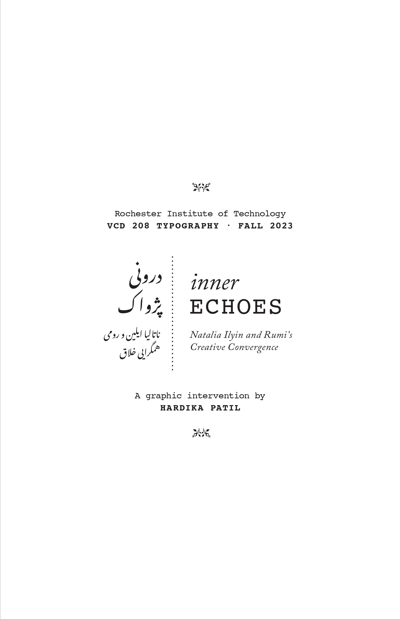
Work 05 of n • Book Design • 2024

Inner Echoes is an experimental typographic book that visualizes the dialogue between texts by Natalia Ilyin and Rumi, revealing how typography can carry emotion, rhythm, and cultural memory beyond words.


How can two voices coexist yet remain distinct?
INTENT
Use typography to transform text into a visual and emotional reading experience.
system
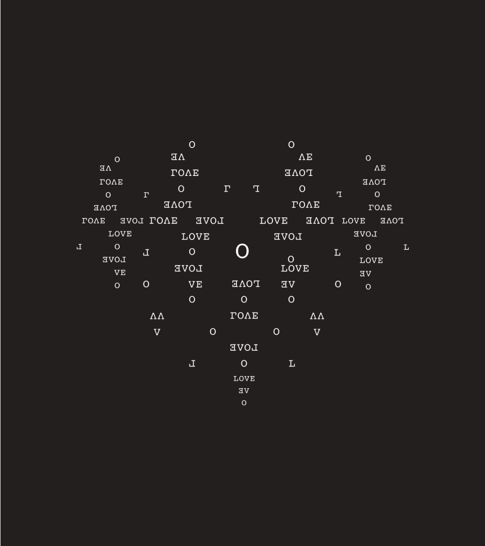
Expressive typographic compositions
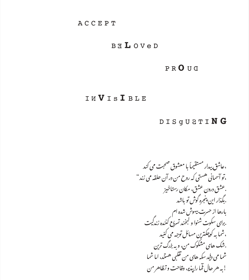
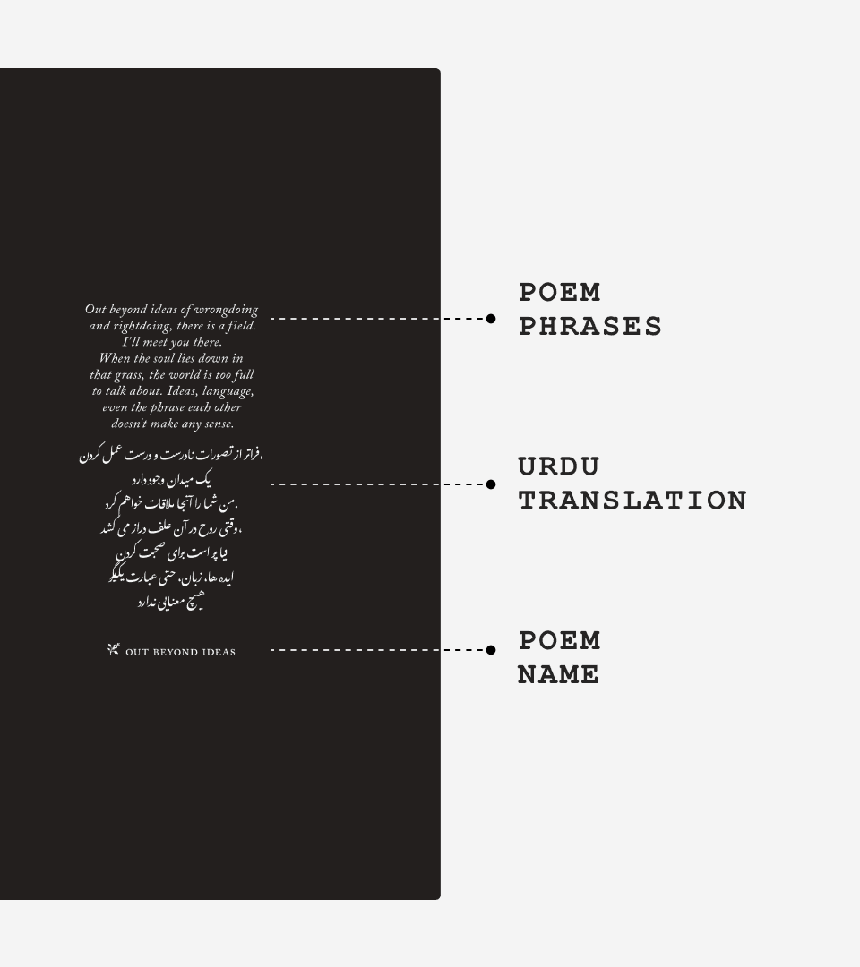
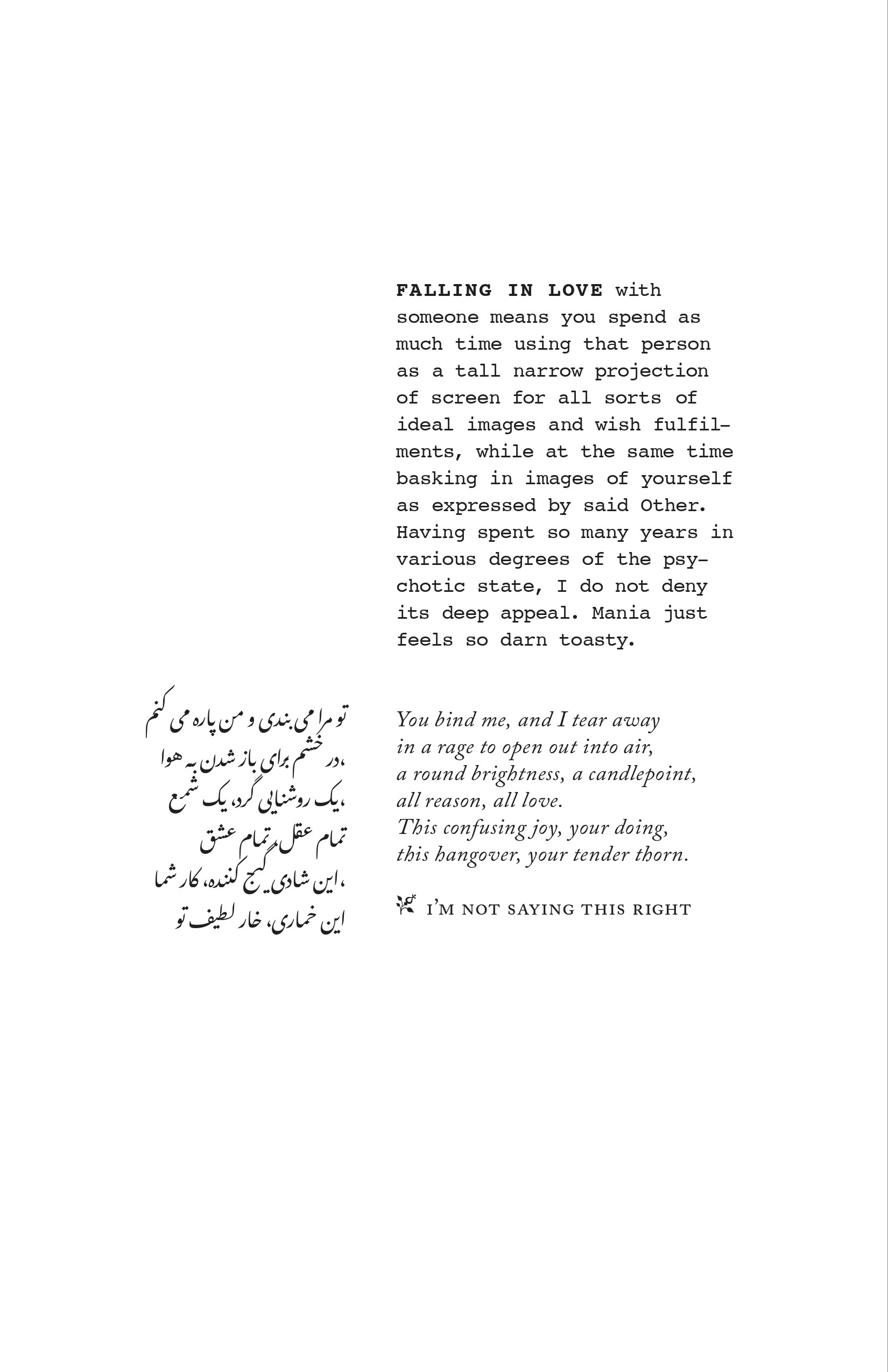
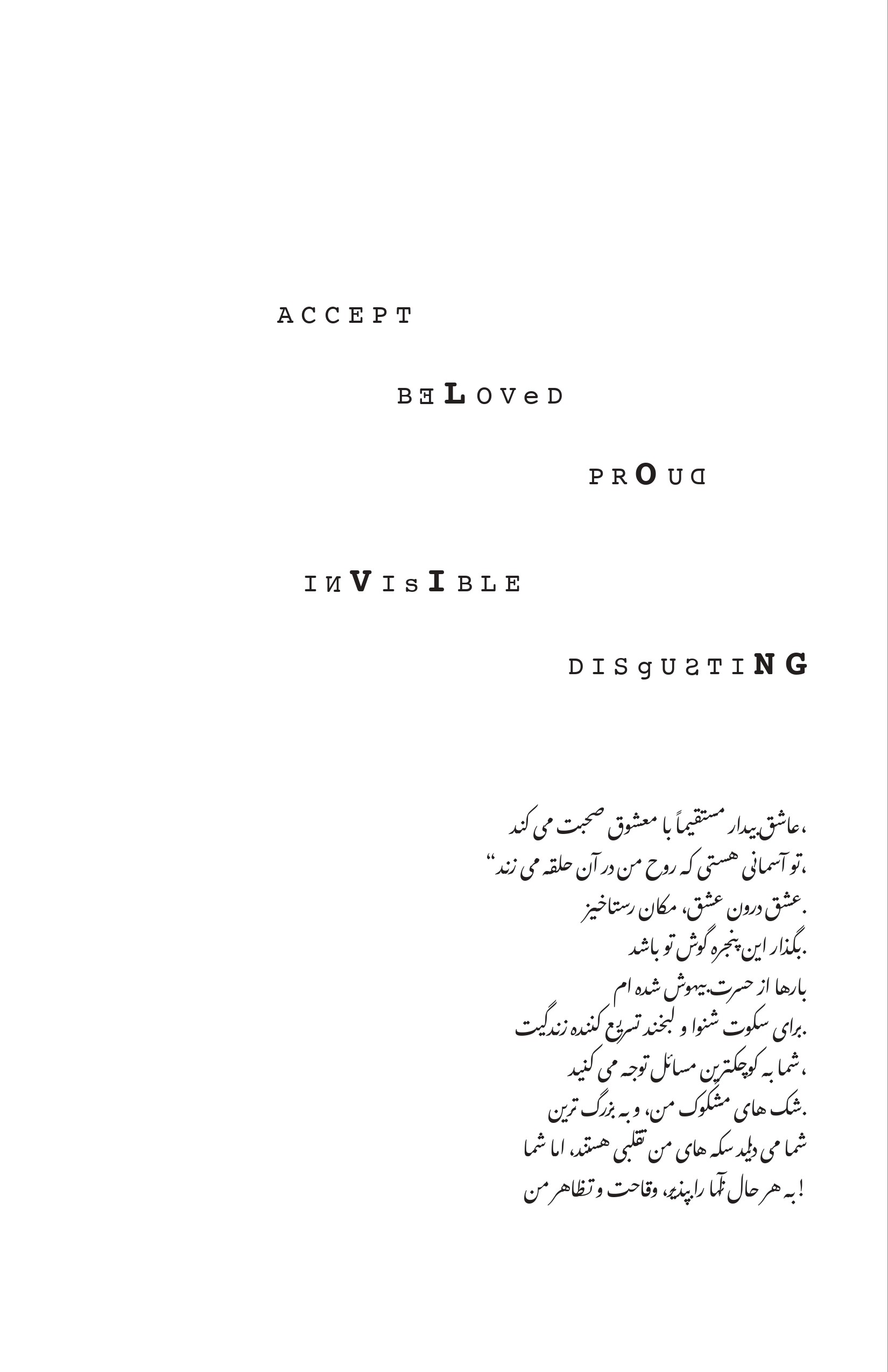
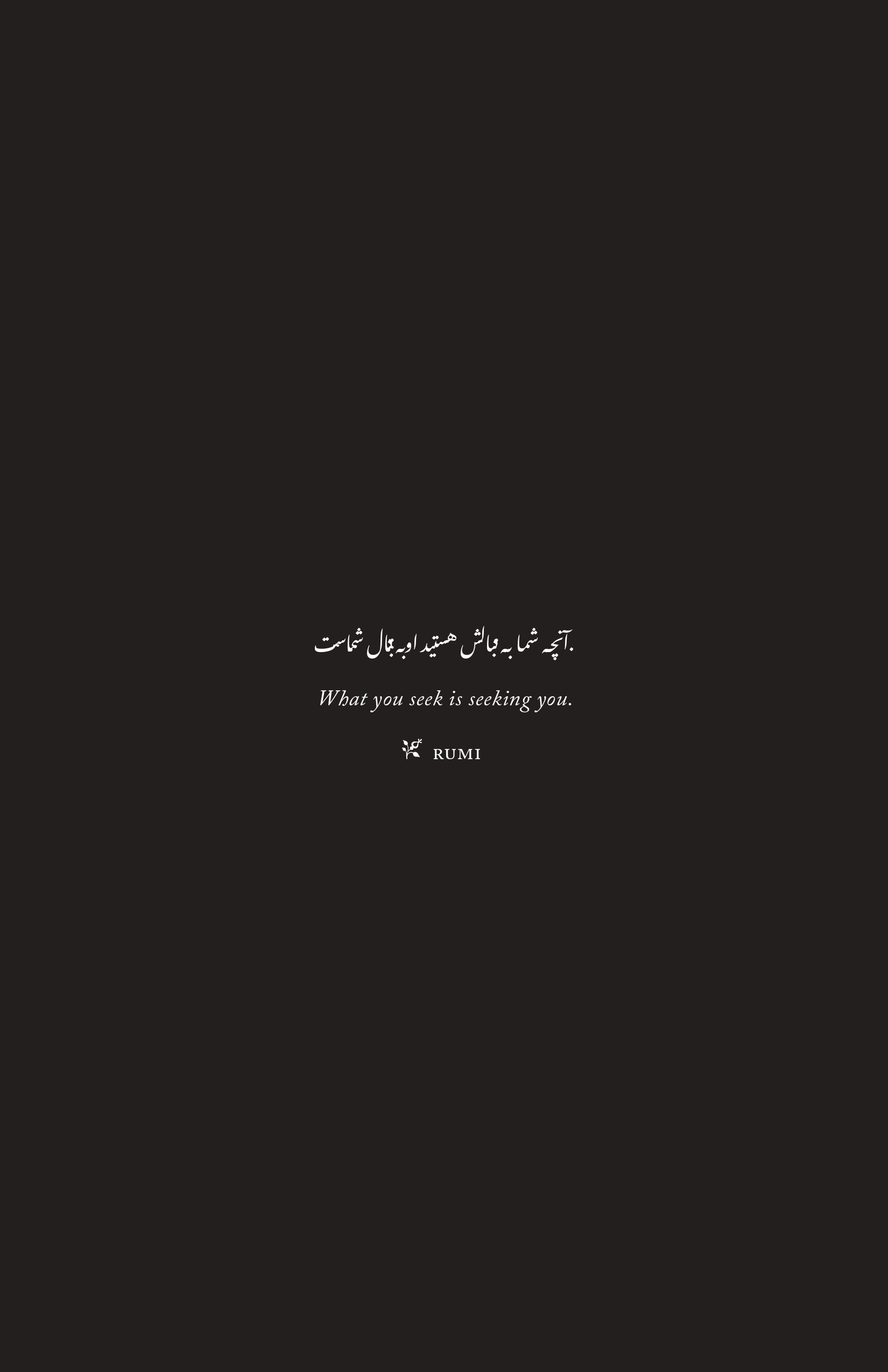
Bilingual text (English + Persian)
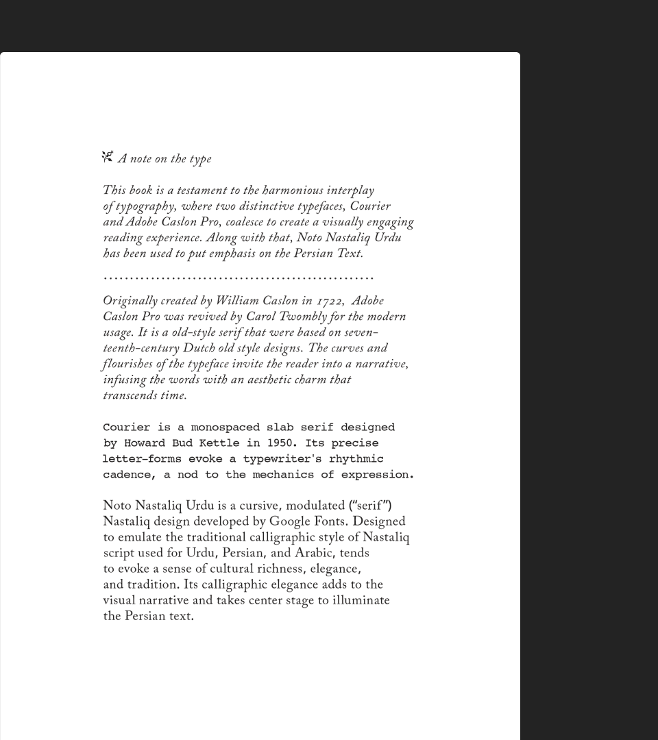
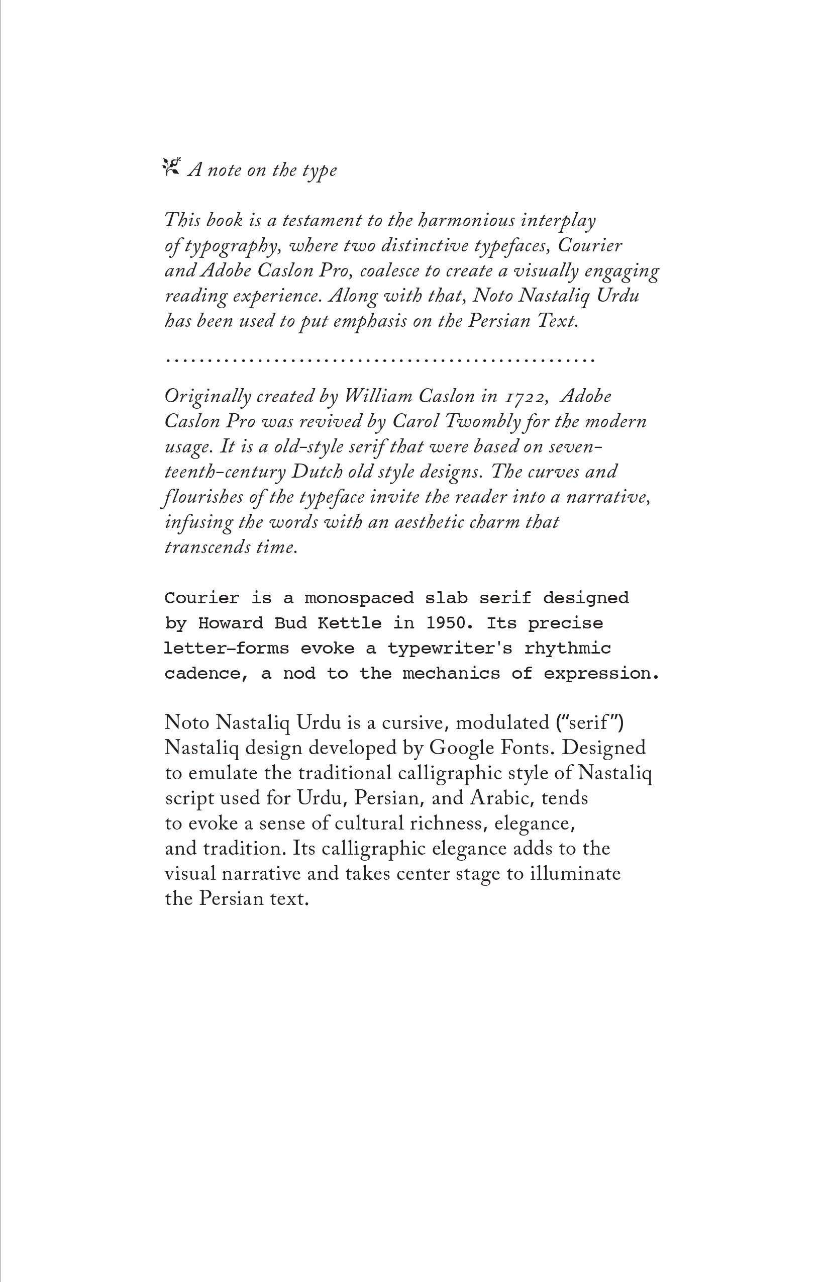
Typeface palette: Courier, Adobe Caslon Pro, Noto Nastaliq Urdu
Spatial rhythm across spreads
OUTCOME
A book where typography interprets the narrative.
Co-Created with Adobe Suite (Illustrator, inDesign)
Two voices, centuries apart — the challenge was making them speak on the same page.
Phase 01: Reading the Source
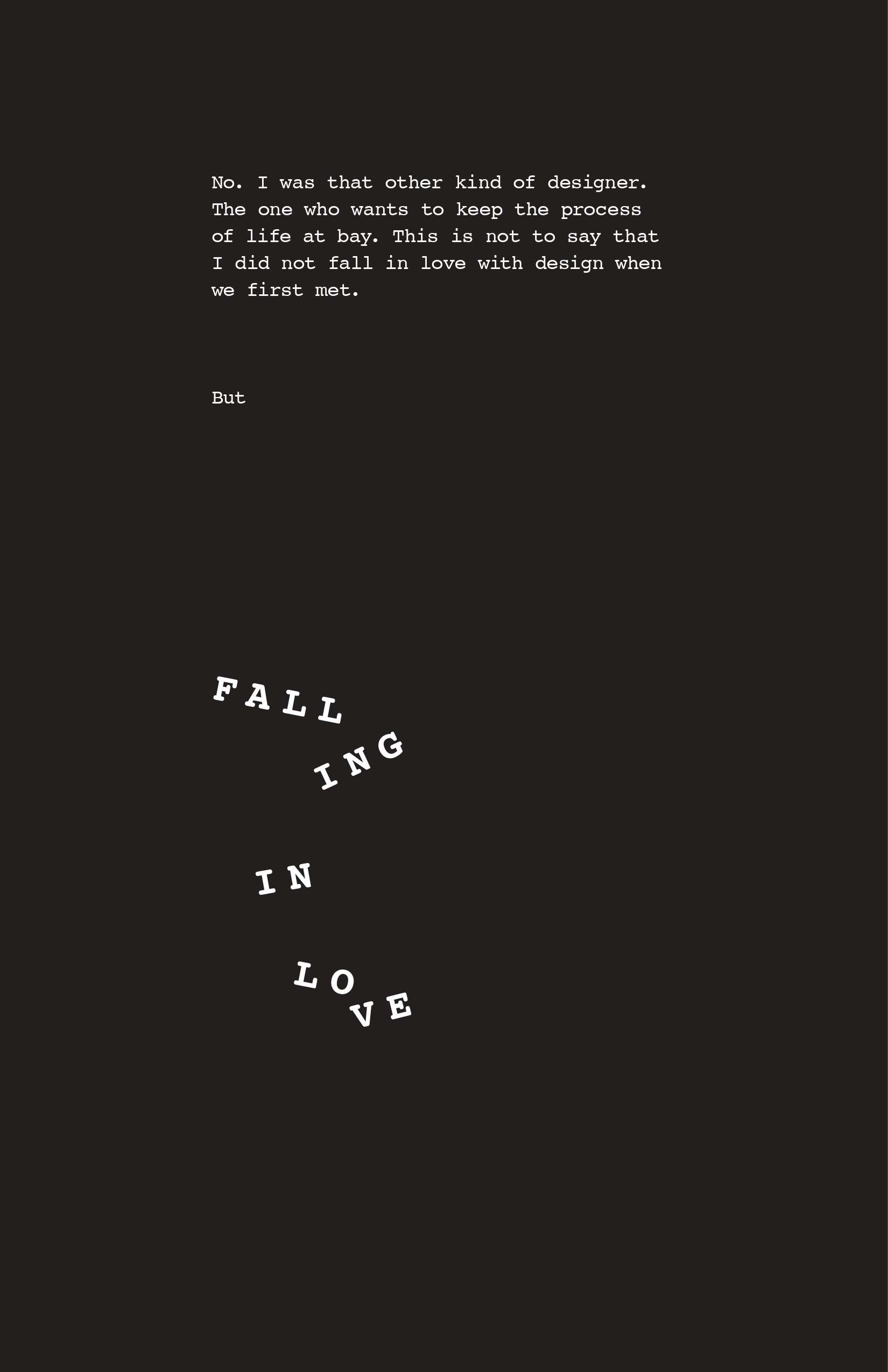
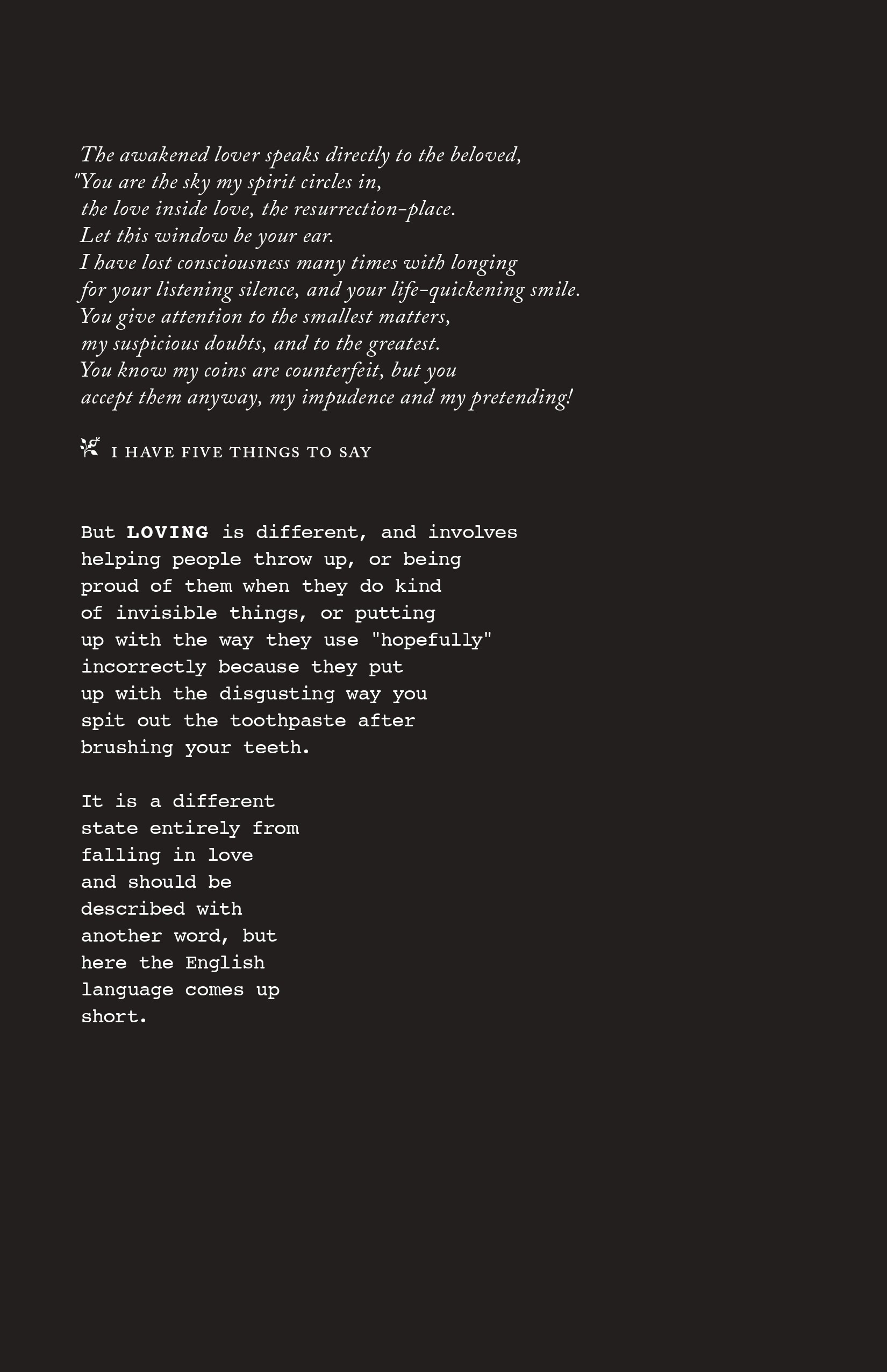
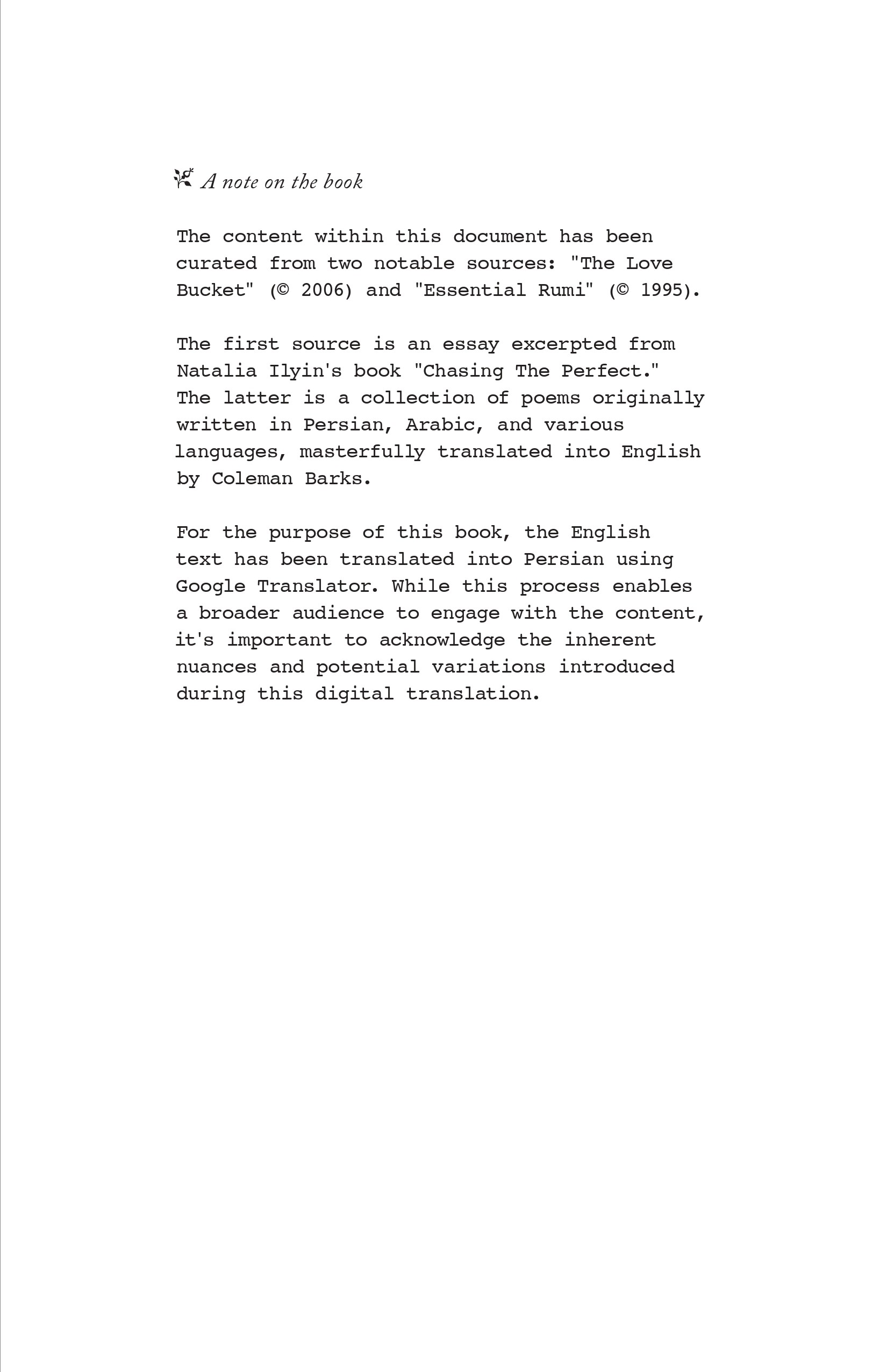
Close reading of Natalia Ilyin's Love Bucket to identify its emotional and thematic threads: the raw material the second voice would need to respond to.
The underlying theme was individualism and intuition.

Phase 02: Finding the Form
Concrete poetry offered a direction — but first, it needed to be understood properly. Through online references and books including 'Concrete Poetry: A World View' by Mary Ellen Solt and 'An Anthology of Concrete Poetry' by Emmett Williams, the rules and possibilities of the form were studied: how meaning emerges through arrangement, spacing, and the visual behavior of letters on a page. If the type itself could carry emotion, the right pairing needed a text with equal rhythmic and emotional depth.

Phase 03: Finding the second Voice
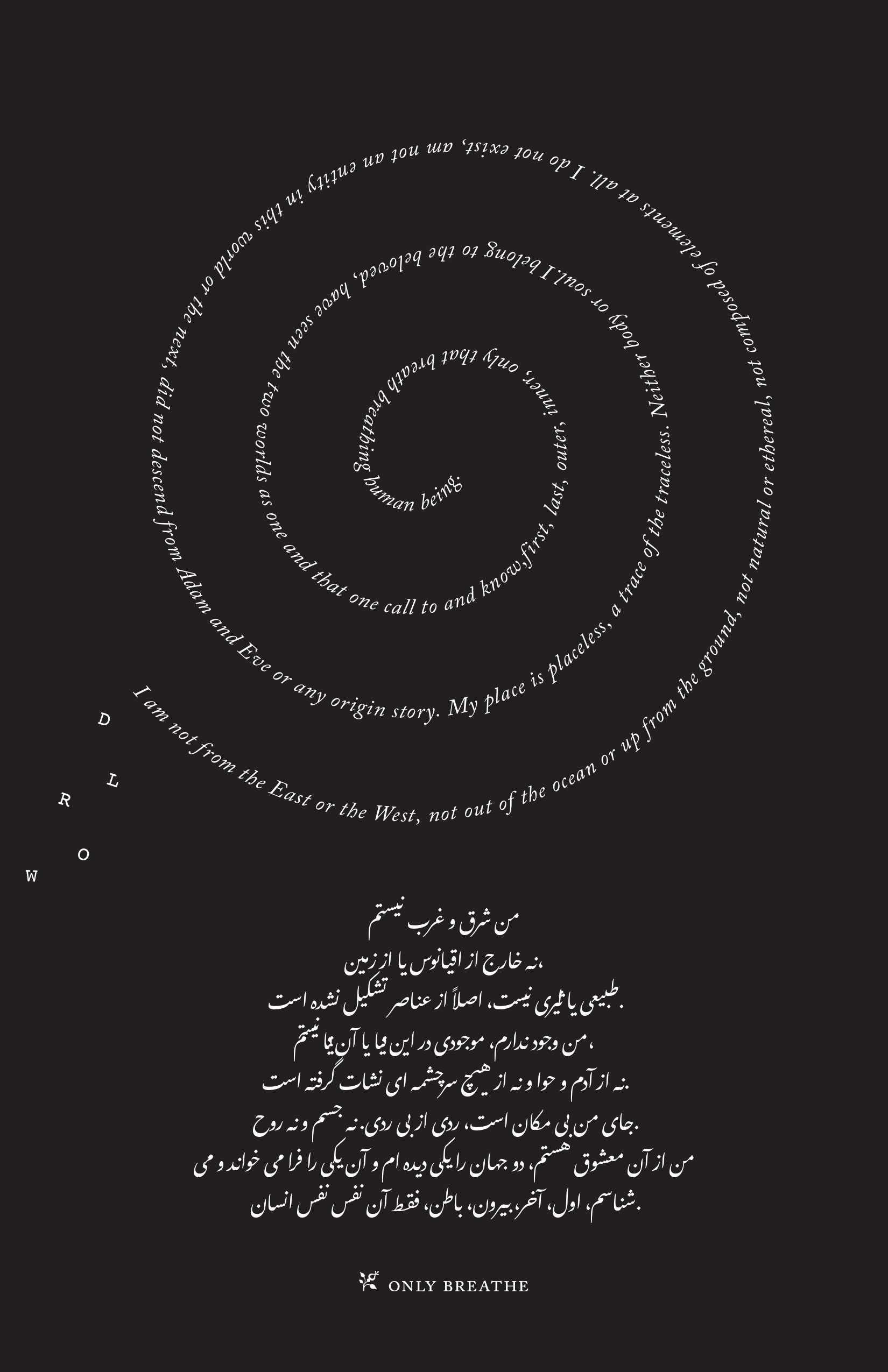
Several poets were considered — Tagore among them. But Rumi kept returning. His work operates on the same frequency as Ilyin's: inner tension, longing, the search for meaning. Once that match was found, the scope locked in around his poems entirely.

Phase 04: Decoding & Mapping
With ChatGPT as a research tool, individual poems were identified, decoded, and mapped against the essay — not to translate them, but to locate where the two voices naturally overlapped, diverged, or echoed. Those points of contact became the foundation for each typographic composition.

Phase 05: Refining the Visual Language
Early explorations used shapes, gradients, and layered elements but these started competing with the texts rather than serving them.
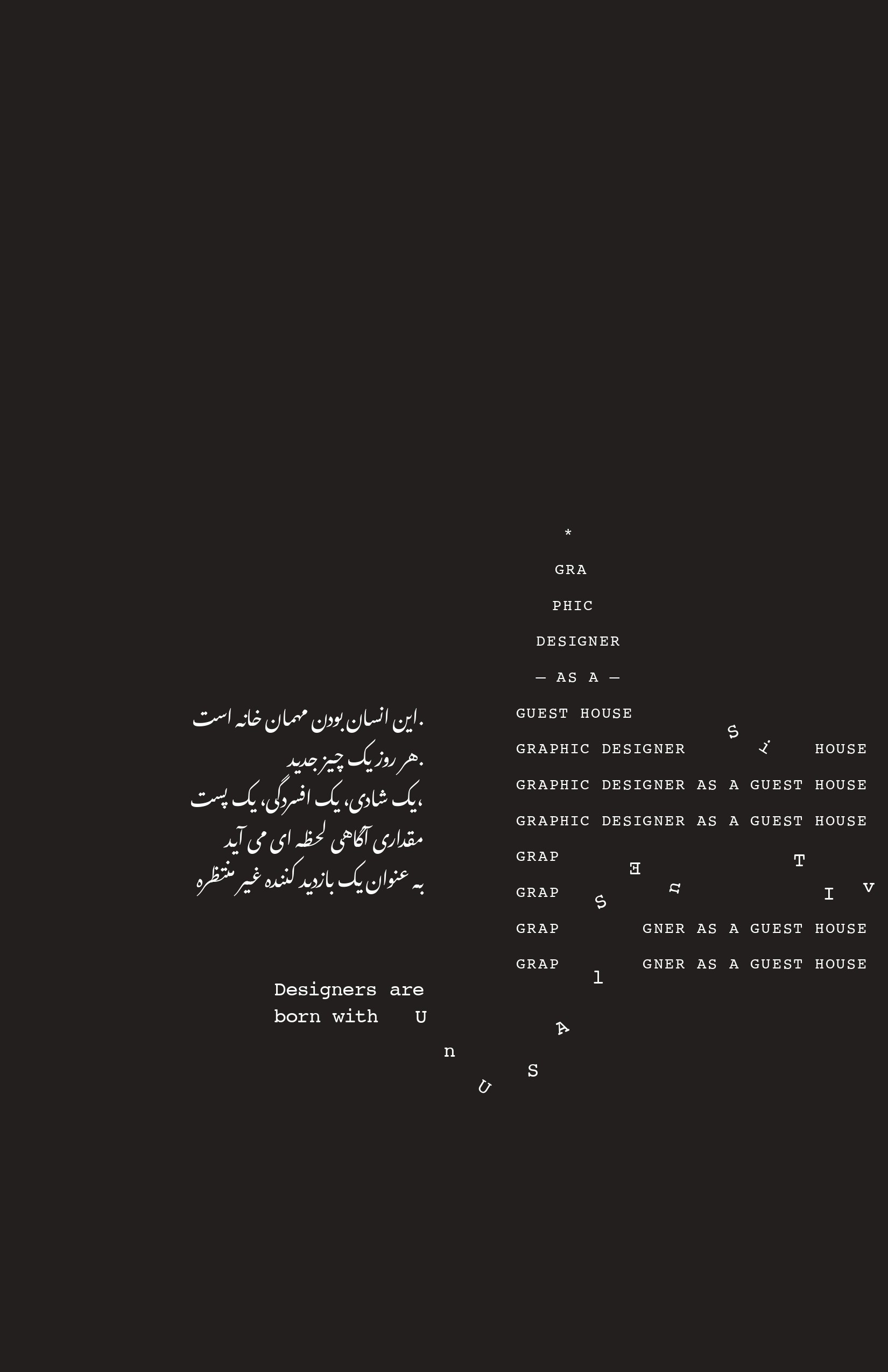
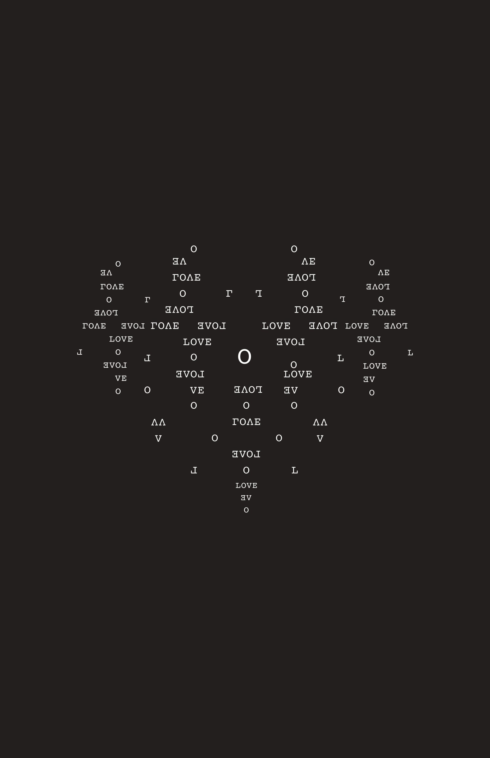
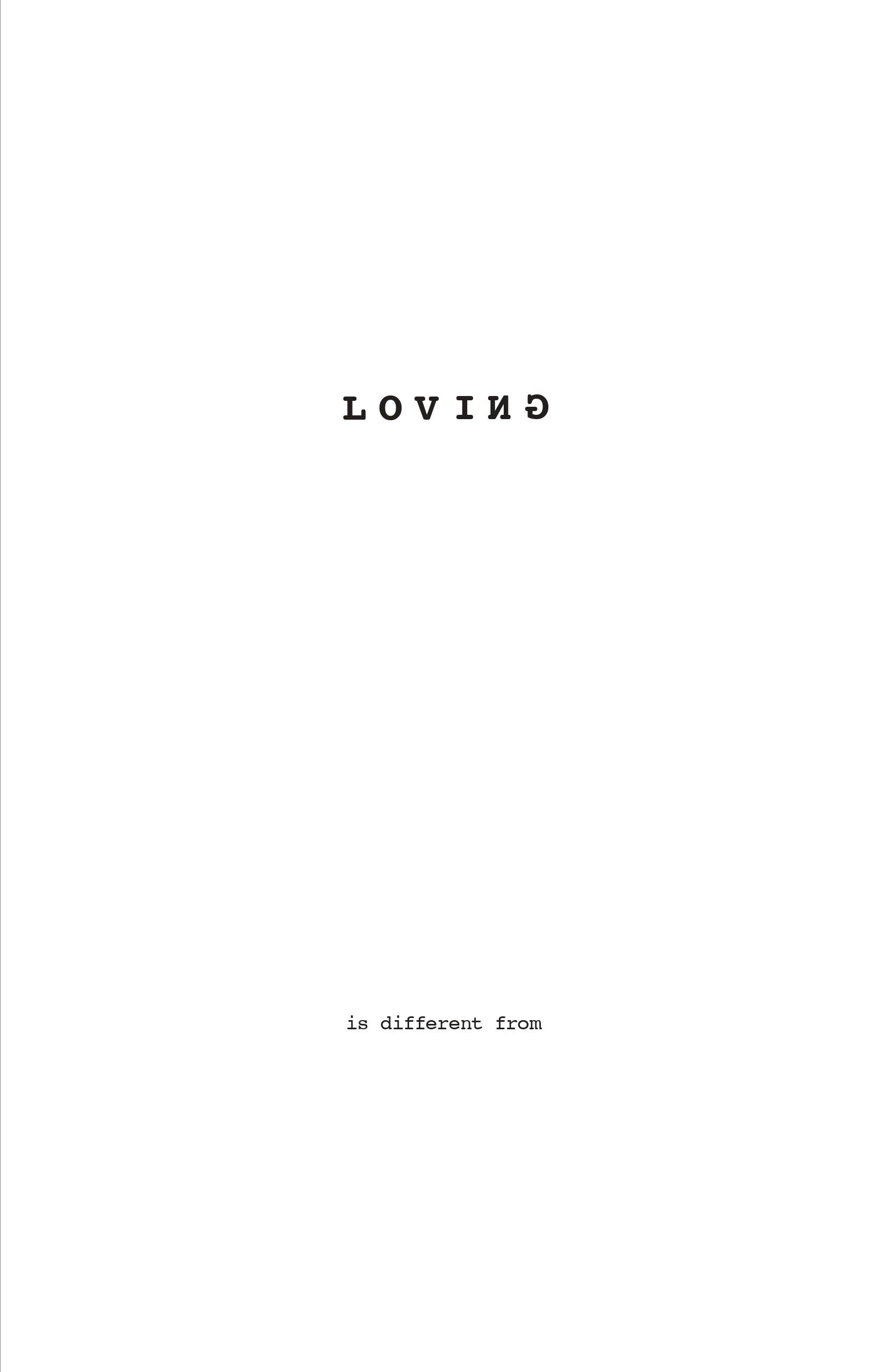
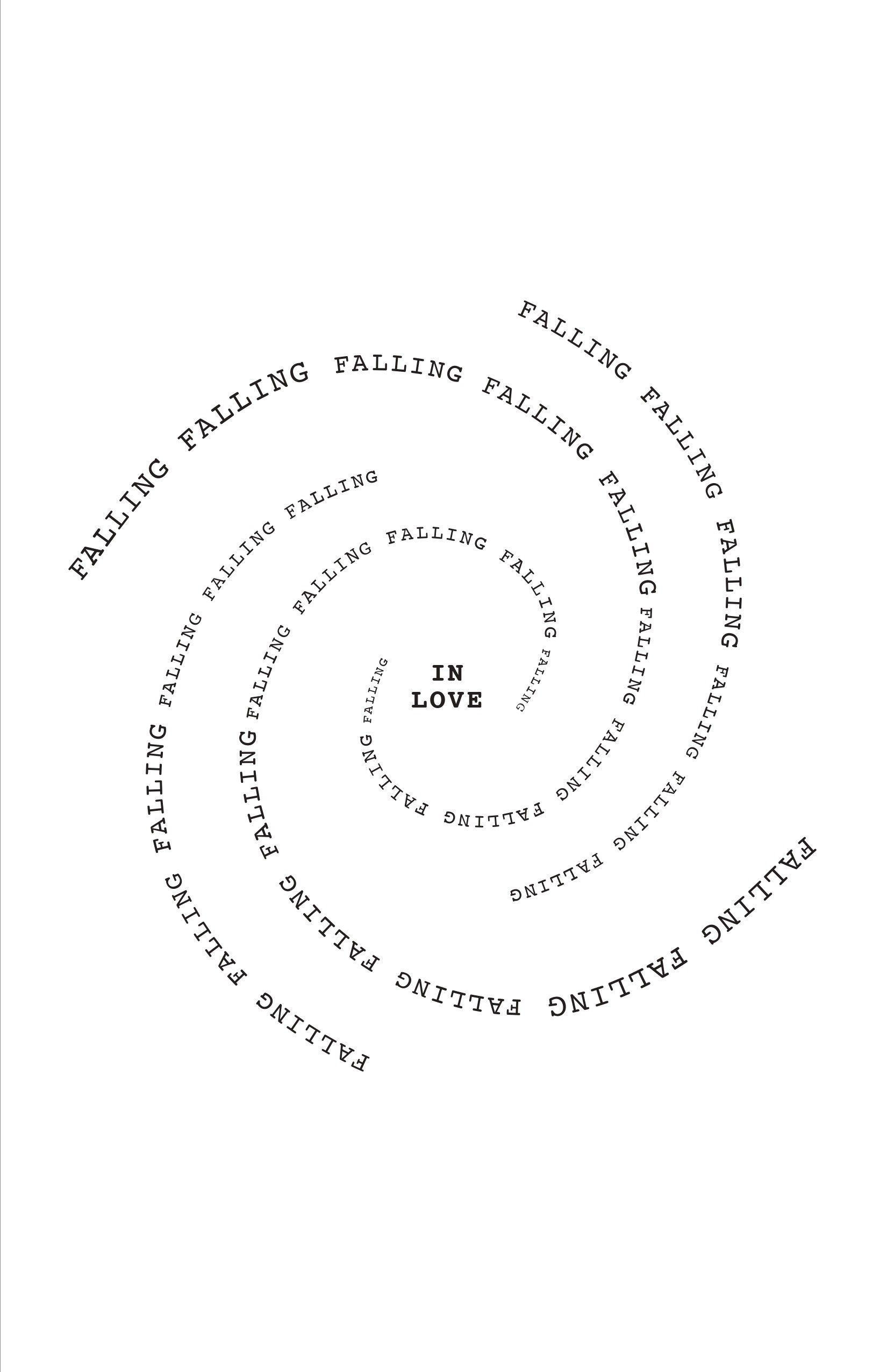
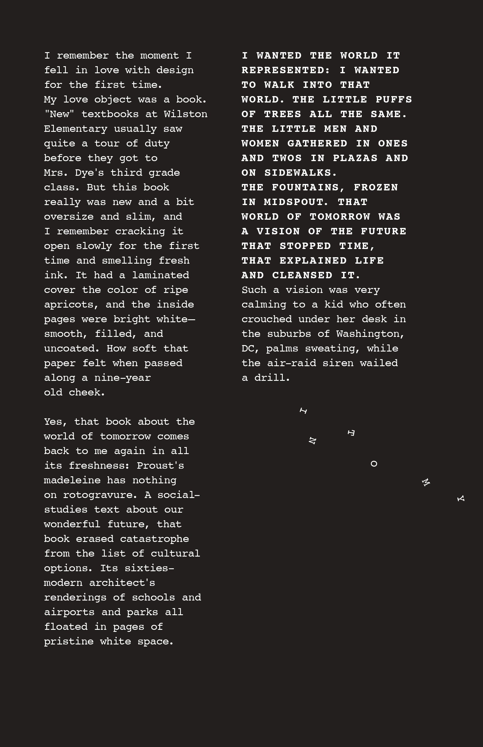
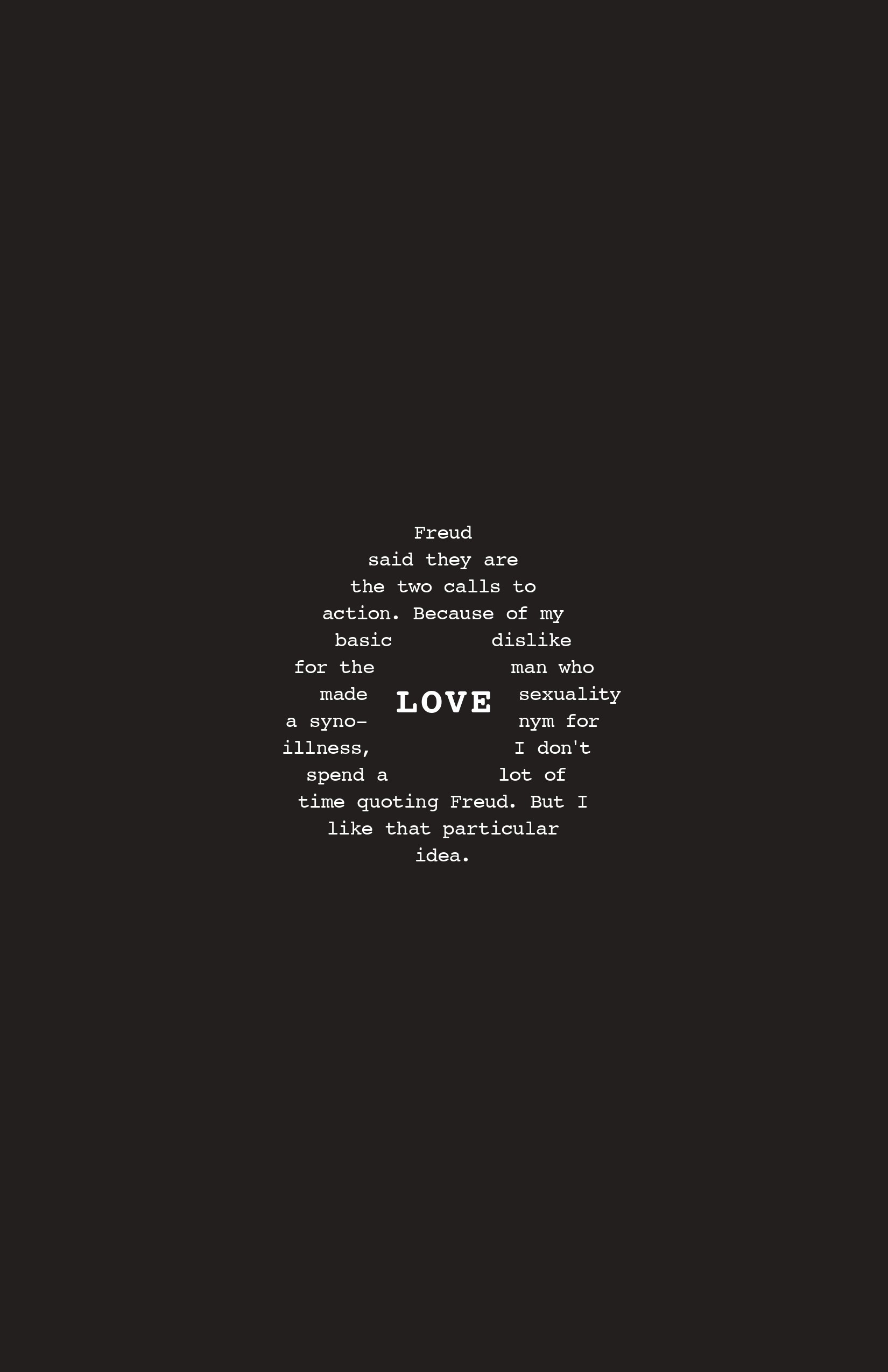
The decision to strip everything back to pure typography came from the work itself: if the project was about two voices in dialogue, the type needed to carry that weight alone. Hierarchy built through font size, spatial formation, and arrangement meant every compositional choice was also a reading choice. The type became the image which stayed true to the texts.

A process of listening before designing — finding the right voice, the right form, and the right points of contact, so that typography could do what words alone could not.

Typographic Dialogue System

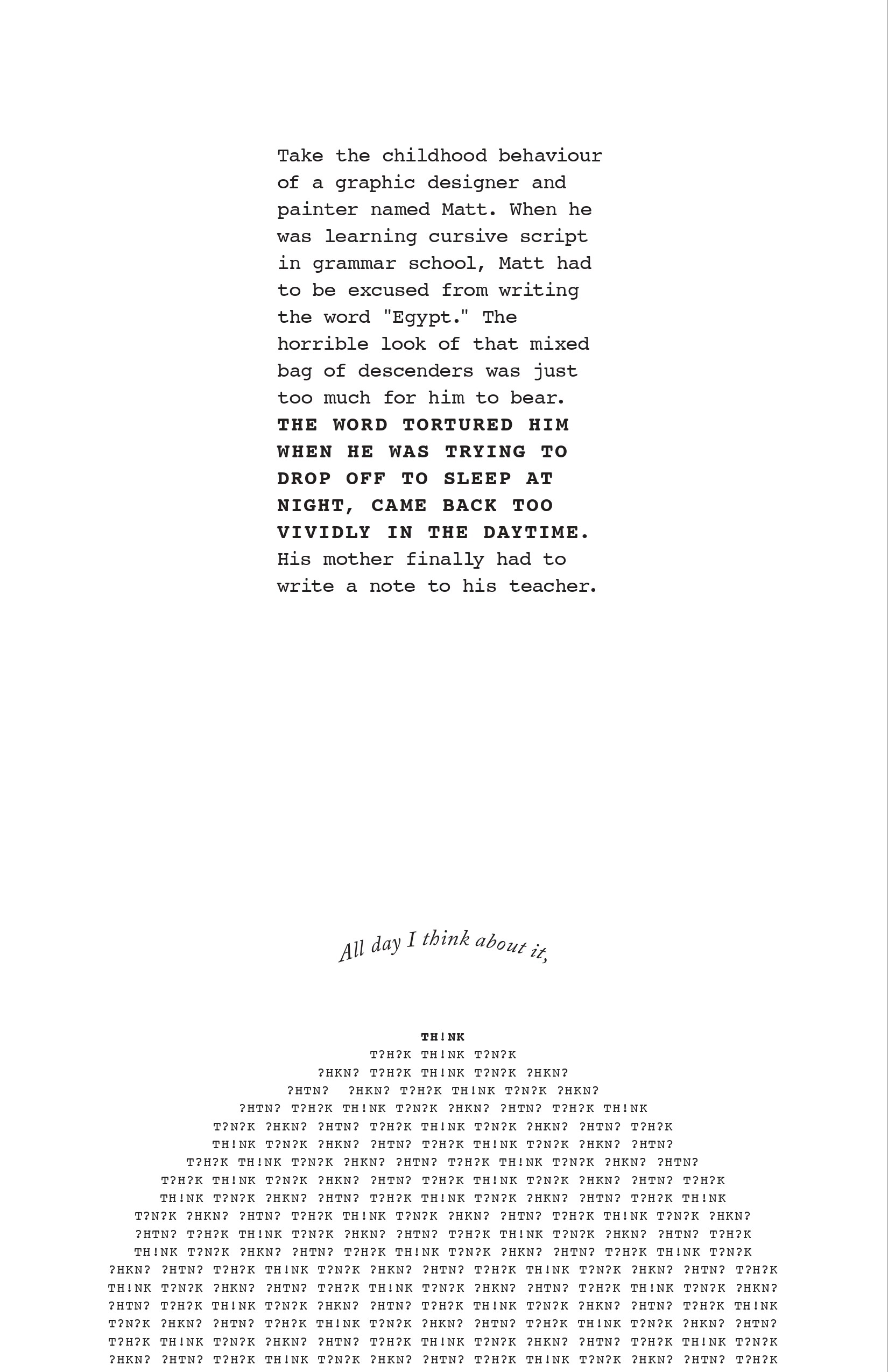
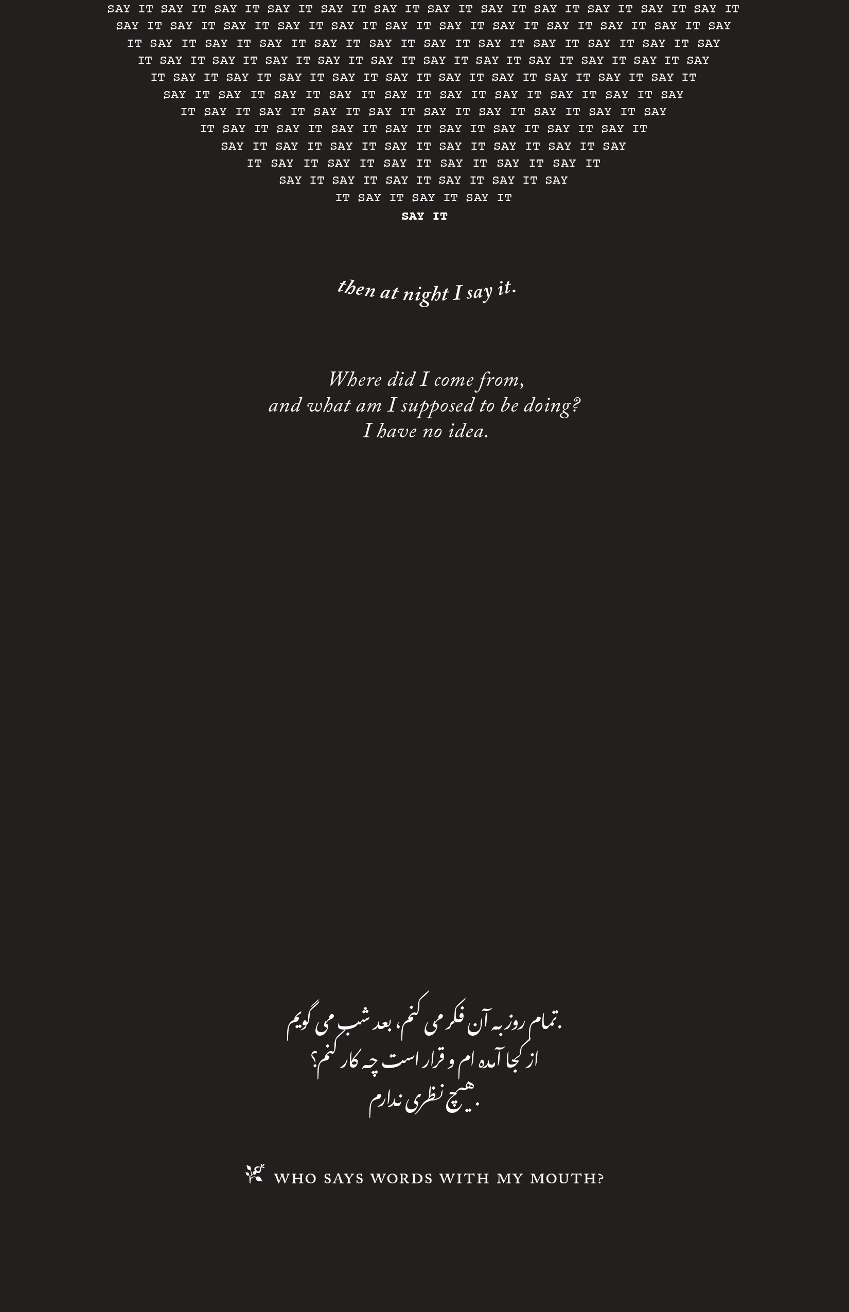
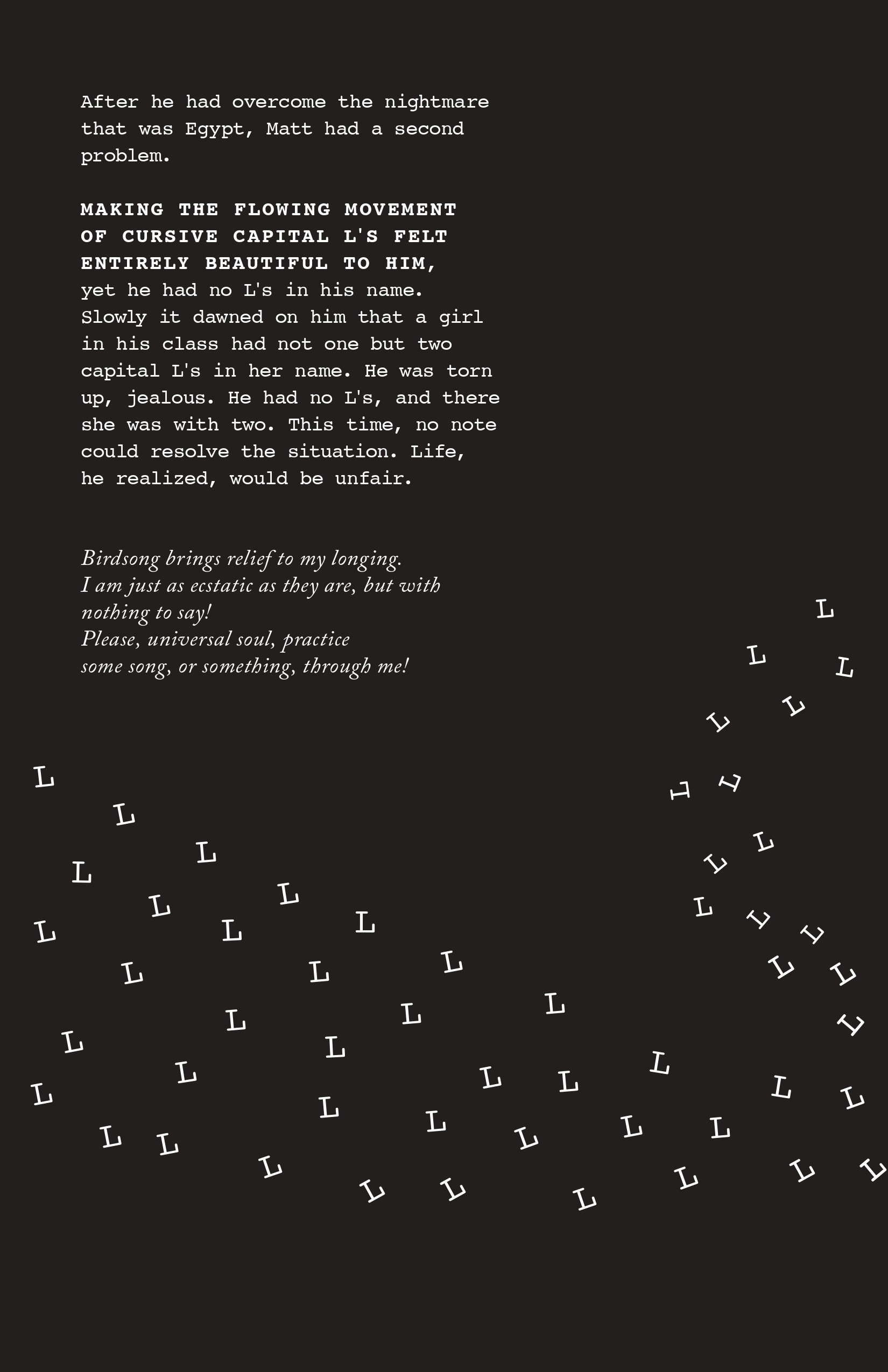
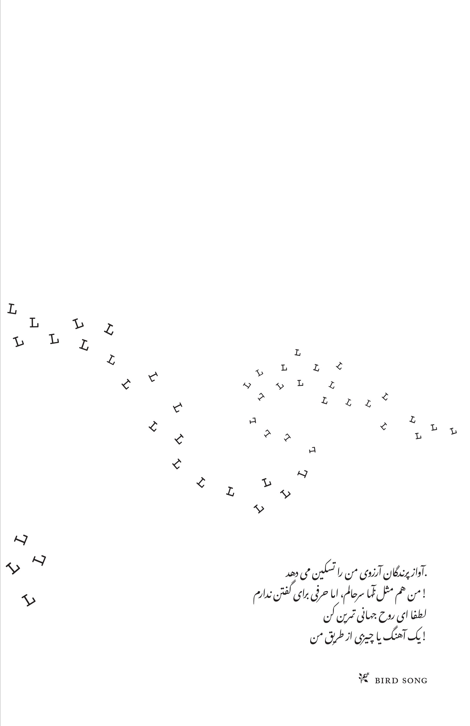
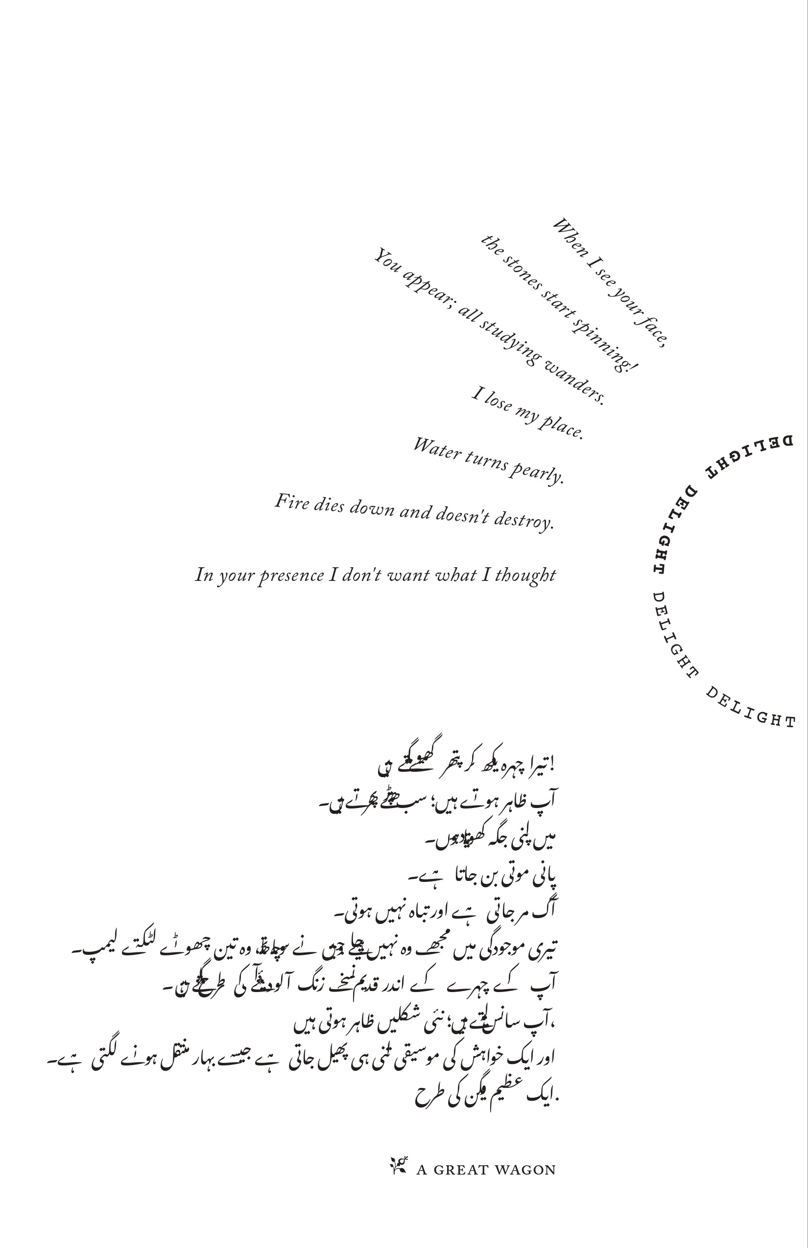
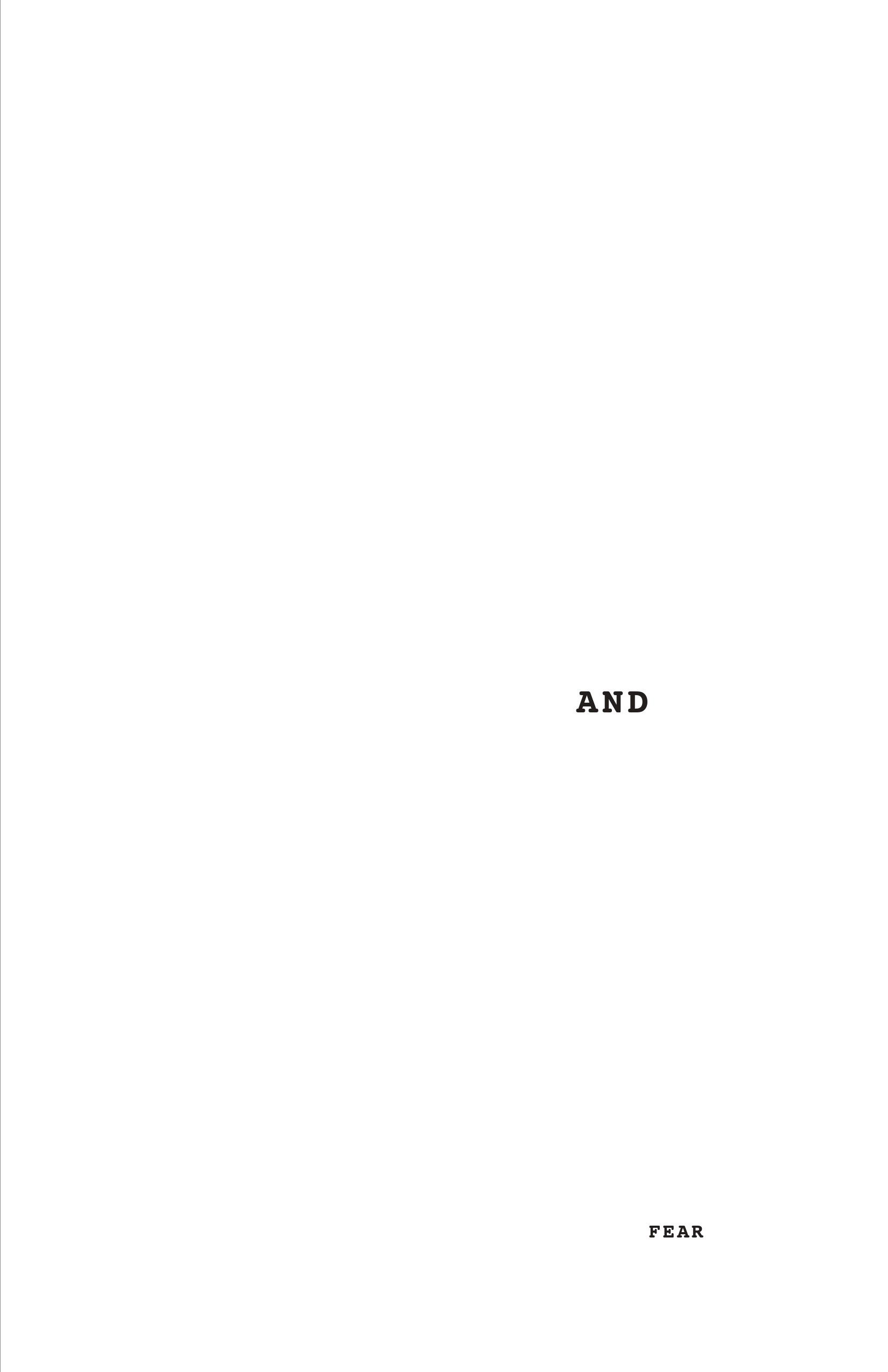
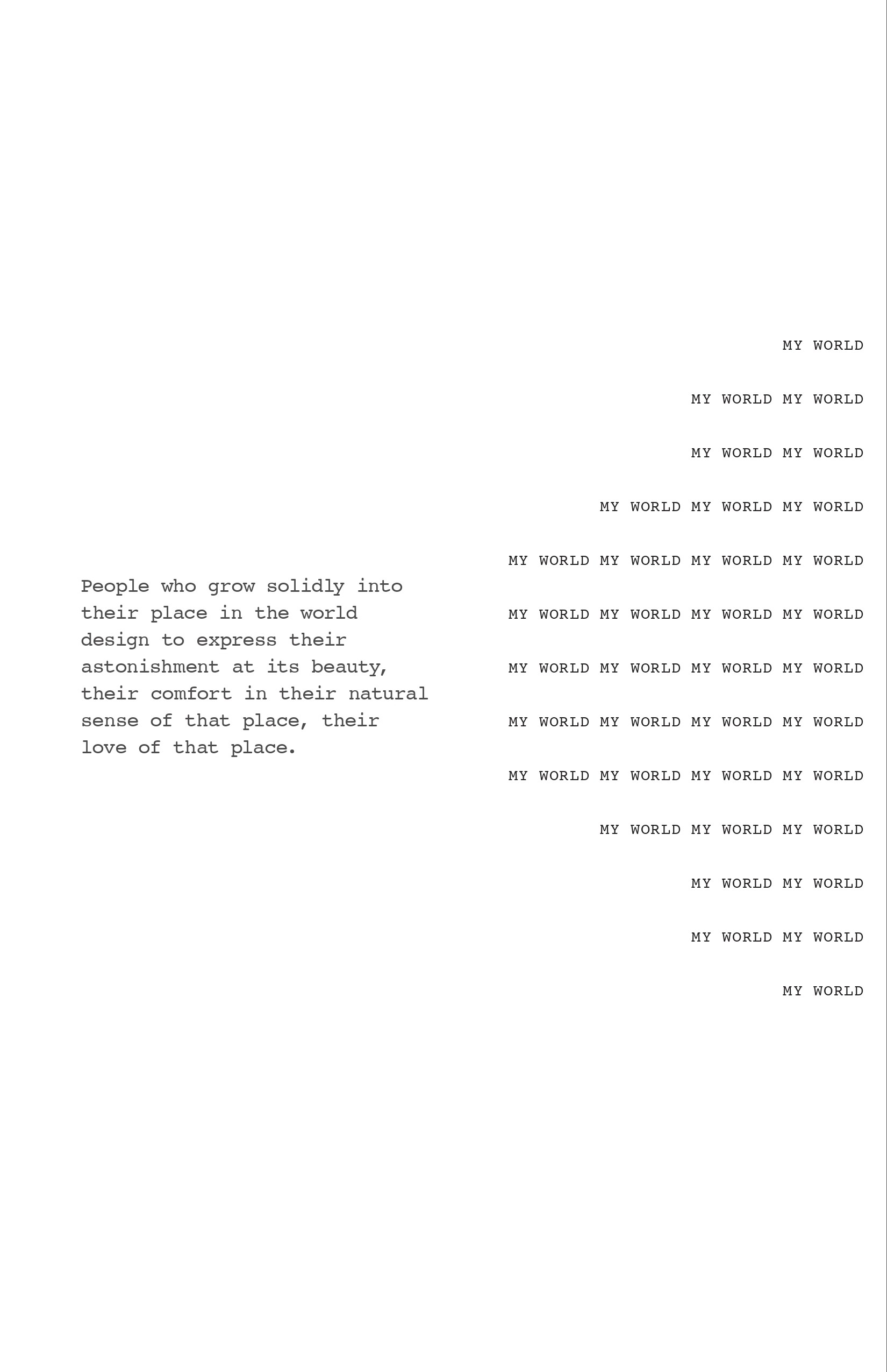
Essay keywords transform into typographic structures that shape the poem

Words expand, repeat, and fracture to mirror emotional states within the texts

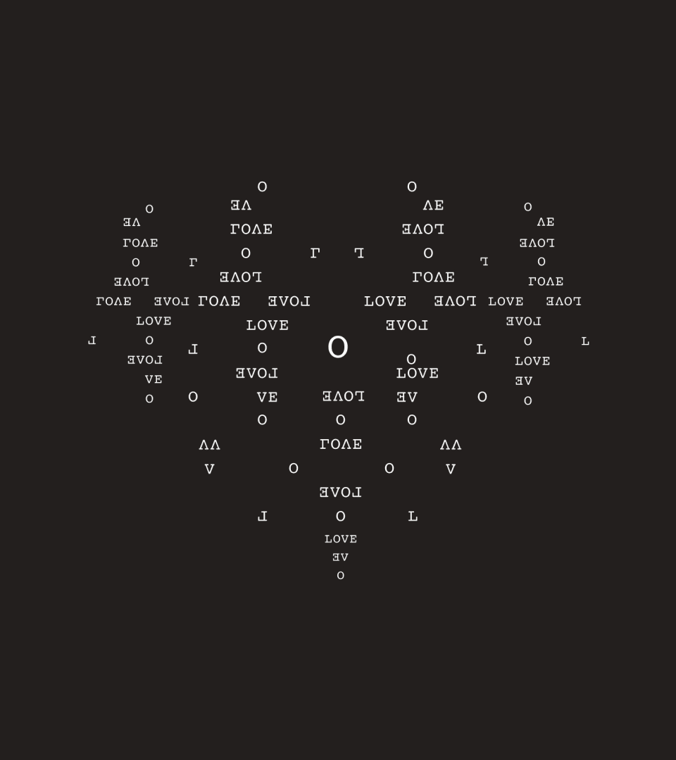


Meaning emerges through typographic composition
Tap the book to flip pages


Through deliberate typographic systems and composition, Inner Echoes turns text into a spatial and visual experience.
Liked this project?
THEN
Let's connect
or see what's next?


©2017-2026.HARDIKA PATIL.ALL RIGHTS RESERVED.
POWERED BY CHAI AND FEEDBACK FROM MY FELLOW PEOPLE.