Work 02 of n • WEB APP DESIGN • 2025

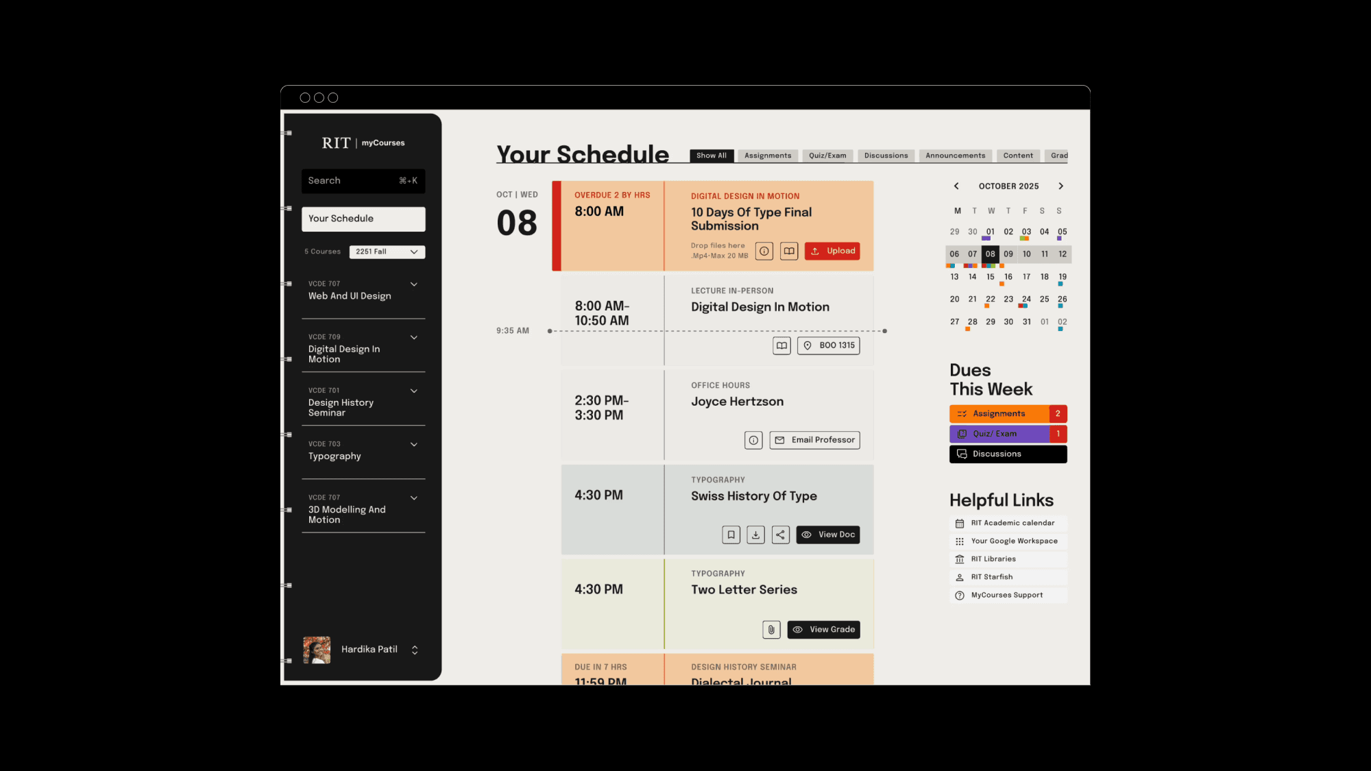
MyCourses is a RIT’s learning management system (powered by Brightspace by D2L) that serves as the central digital platform for all academic tasks, from accessing critical content to submitting assignments and tracking progress.
Before and After Redesign
How can students focus on what matters?
shift
From scattered information to clear, actionable priorities
system
Unified dashboard showing assignments and deadlines
Color-coded task counts for quick prioritization
Simplified submission flow reducing steps
Consistent navigation and information structure
Reusable UI components supporting scalable courses
impact
Reduced clicks by 80%
Simplified submissions from 4 steps to 2 for faster submissions
Enabled 2–3 click access to key academic tasks
Co-Created with Figma
The context • The problem • the gap •
Core academic tasks required scanning, searching, and guesswork.
THE SYSTEM PROBLEM
myCourses functioned as a content repository rather than a decision-making tool.
Students could not quickly answer:
What is due next?
What have I completed?
How do I find course materials easily?
The platform demanded scanning and guesswork before work could begin.
Research Insights
Primary research included:
15 survey responses
6 in-depth interviews
This revealed recurring structural barriers that compounded friction across the experience.


competitor analysis
Canvas & Google Classroom: Strong individual course management.
Critical gap discovered: Zero cross-course task aggregation.
It matters because scattered information forces students to search, track, and synthesize tasks across platforms, draining time and focus. The opportunity was a unified dashboard that shows what needs attention now.
The objectives • The strategy • the design outcome •
The goal was to design an action-focused digital binder for students.


Internal Course Navigation
Multi-step process for context switching.
Repetitive search actions to find course pages.
calendar
Low visibility; displays submitted assignments.
Quick links lack essential assignment details (format, info).
left navigation
Always Accessible
The permanent left navigation centralizes course context and highlights immediate needs with badge counts.
The Binder tab metaphor, featuring expandable drop-downs, establishes a maximum two-click access for all critical content and tasks.
default schedule view
the action sheet
The default vertical, chronological timeline establishes a time-based mental model, instantly prioritizing “due now” tasks and transforming the Schedule into the student’s primary execution dashboard.
Global Filters Tabs to Instantly Sort by Activity Type
RIGHT PANEL
THE CONTEXT HUB
A color-coded component “Dues this week” providing an instant, quantified count of all outstanding tasks (e.g., 04 Assignments), immediately communicating the exact scope of the weekly workload.

An Action-focused Color Coding System With Badge Count

Integrated Calendar for Planning to Reduce Long-Term Anxiety

Lecture Time Office Hours Right On The Schedule

Lecture Time And Office Hours On Each Course Page
Grades check with one-click and discreet access.

Current Assignment Submission User Flow

Redesigned Assignment Submission User Flow
Instructions & related course content integrated in the assignment card

Assignment Card as Droppable Zone

An Action-focused Color Coding System With Badge Count

Current Content Access User Flow

Redesigned Content Access User Flow

View Folders in a Concise Way
Scrollable Announcement Cards
Jump between sections using the course card itself

The COMPONENTS • The DESIGN SYSTEM • the UI ELEMENTS •
Inspired from the analogue binder, simple and scannable.

Style
Clean
Color-Coded
Strong Typography
Elements
Binder Tabs
Cards
Sticky Notes
Lines
Legend/ Icons


The UX PROCESS • The UI DESIGN • the VARIANTS •
Multiple explorations via iterative design process.
Phase 01: UX Flow
The process began by mapping keywords that captured the spirit of Himalayan Odyssey. These ideas were translated into visual directions through:
mind maps
icons
indexes
symbolic sketches.

Phase 02: Typographic Exploration
The exploration shifted to typography and visual metaphors:
Using action verbs and rhetorical prompts to spark ideas
Mountain-shaped letterforms expressing Himalayan terrain
A wheel symbol representing the rising sun and the rider’s journey

Phase 02: Typographic Exploration
The exploration shifted to typography and visual metaphors:
Using action verbs and rhetorical prompts to spark ideas
Mountain-shaped letterforms expressing Himalayan terrain
A wheel symbol representing the rising sun and the rider’s journey


Phase 02: Typographic Exploration
The exploration shifted to typography and visual metaphors:
Using action verbs and rhetorical prompts to spark ideas
Mountain-shaped letterforms expressing Himalayan terrain
A wheel symbol representing the rising sun and the rider’s journey


Phase 03: hands-on experimentation
The strongest concepts were explored digitally and through hands-on experimentation:
Vector explorations testing structure, rhythm, and composition
Permutations of typographic forms and symbol integrations
Analog experiments using materials like powder and paper to generate new visual possibilities


Phase 04: digital refinement
The final direction was refined through careful typographic and structural adjustments:
Testing layouts, lockups, and typographic relationships
Refining proportions, spacing, and hierarchy
Over 500 sketches and concepts explored before arriving at the final mark


The IMPACT • The EXPERIENCE • the FEELING •
From Overwhelmed to In Control
The redesign successfully transforms the LMS from a bureaucratic hurdle into a fast, organized tool. By applying the Digital Binder metaphor, the final design achieves clear visual hierarchy through semantic color-coding, centralized communication by grouping essential faculty contact/logistics.
It successfully transitions the student experience from one of being “Overwhelmed” to one of “Confidence” by making their academic workload clear, organized, and immediately actionable.


Liked this project?
THEN